2020
All workSamsung.com Global Navigation
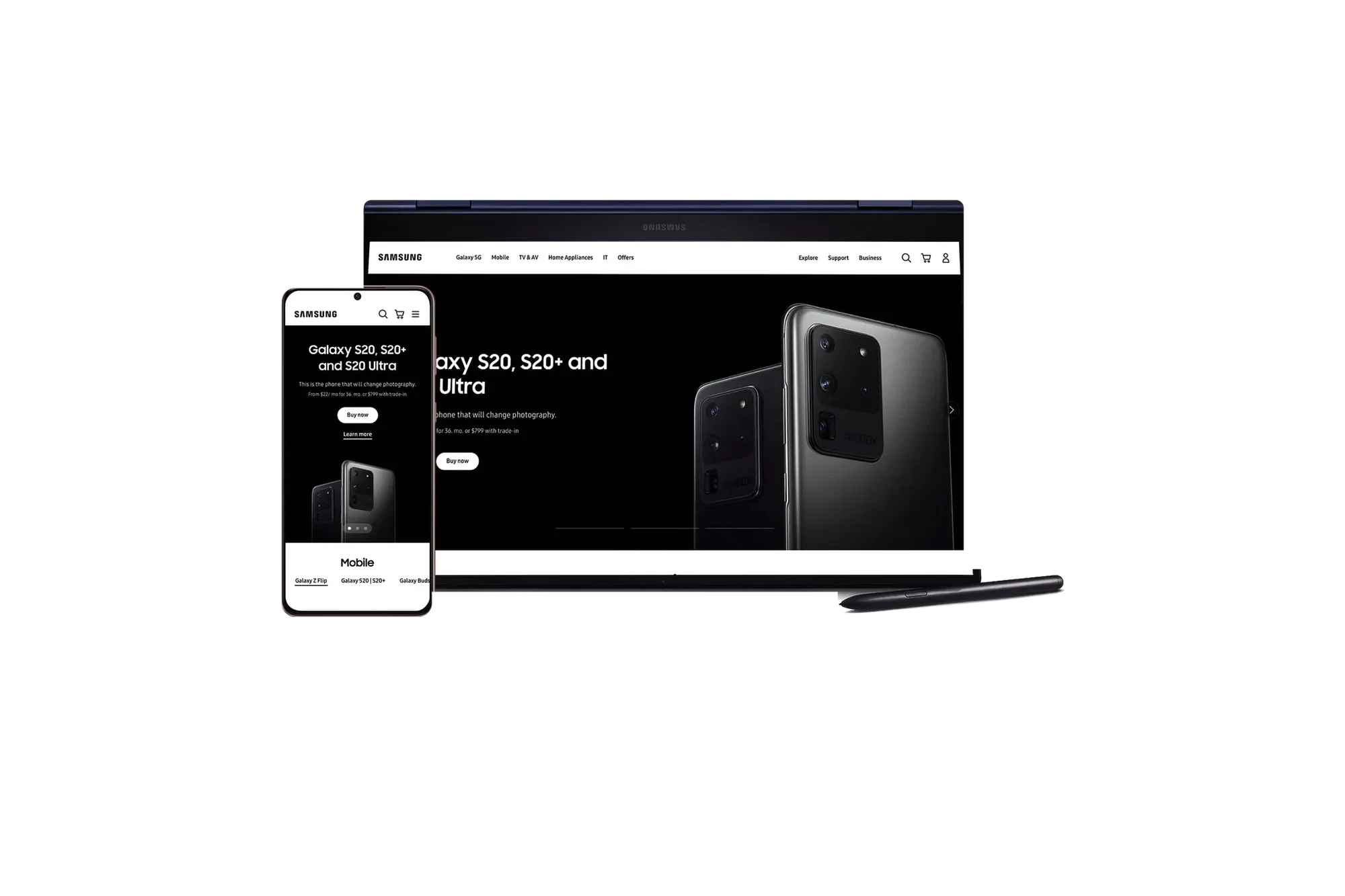
Design system and global navigation for Samsung.com across 12+ markets.
I set the visual direction for Samsung.com’s global navigation, the menu every shopper in 12+ markets uses to find a product. I was a Senior Designer on a twelve-designer, six-month redesign, and I also built page layouts and contributed components to the design system. The GNB was the hardest problem and took most of my time.
The Problem
Samsung.com’s navigation had accumulated complexity from years of market-by-market additions. Different product catalogs meant different category hierarchies. Different languages meant different string lengths and overflow behaviors. Right-to-left scripts flipped the entire spatial logic. Every market had its own workarounds. The challenge was designing a navigation strict enough to read as one brand globally, but flexible enough that no market needed to break it.
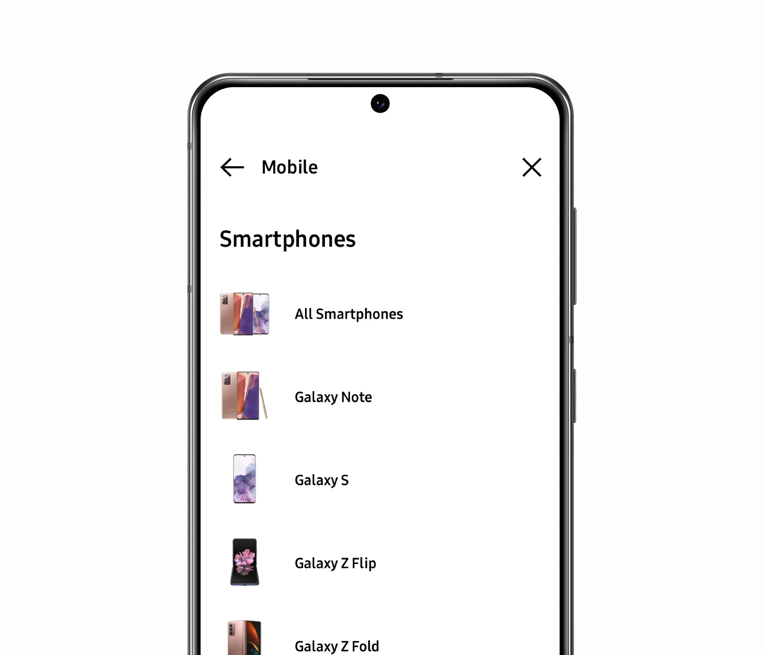
Global Navigation
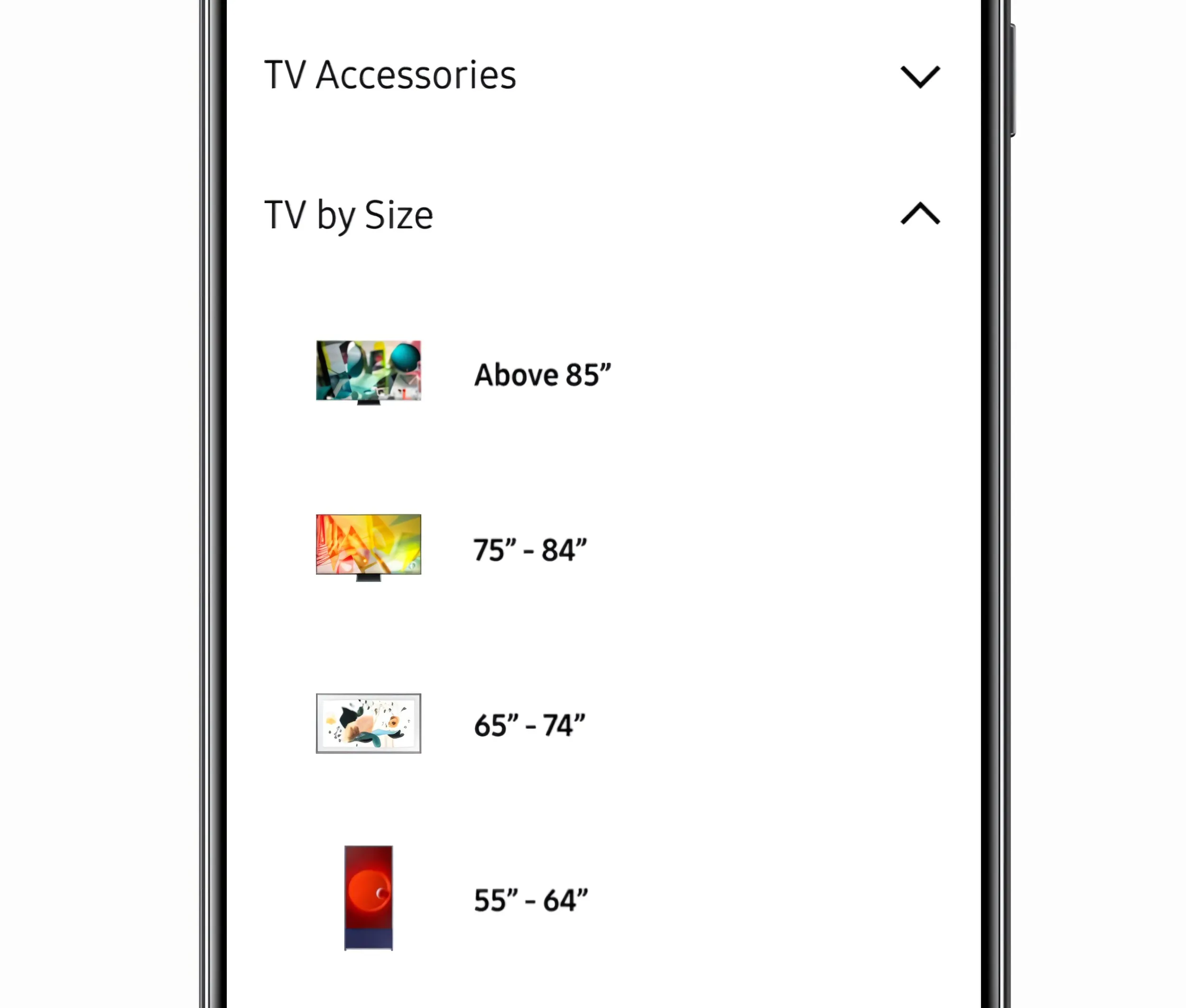
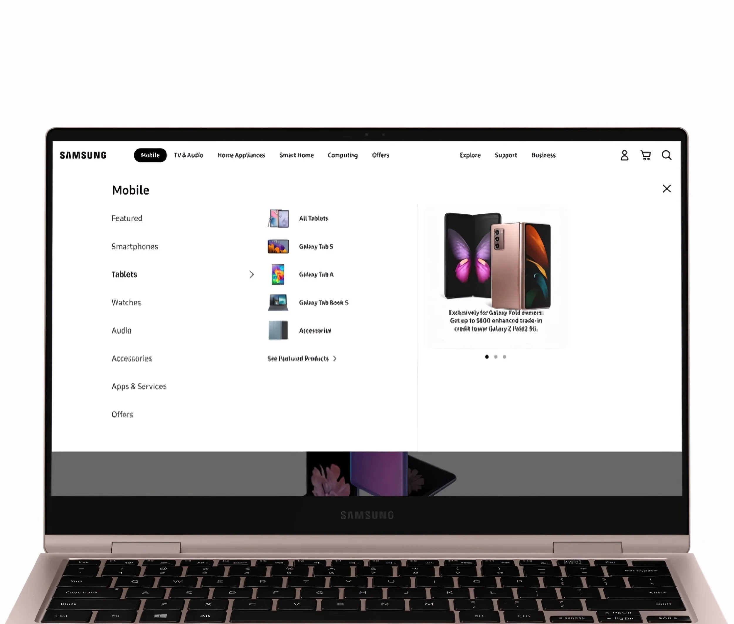
The navigation had too many levels, and cutting depth couldn’t mean hiding products. My visual direction put a product image beside every category, from the desktop menu down to a mobile drill-in, so a shopper spots the Galaxy Z Flip or the 75-inch TV before reading its label. I prototyped variations and stress-tested each against right-to-left scripts, deep catalogs, and long item lists, aiming for one navigation no market needed to fork.
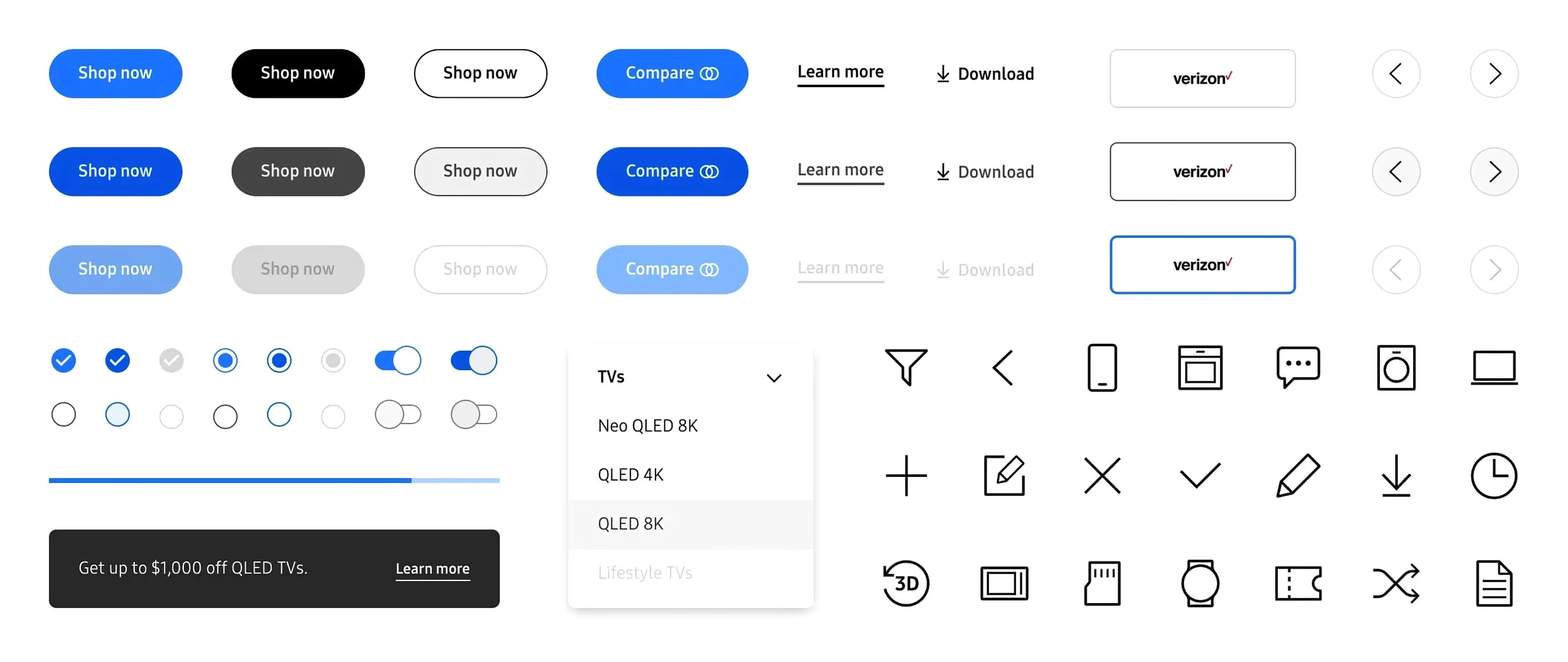
Design System
I contributed atoms and components to Samsung’s design system: pieces that regional teams could compose into market-specific pages without breaking brand consistency. The system had to hold across 12+ markets with different content lengths, imagery, and promotions.
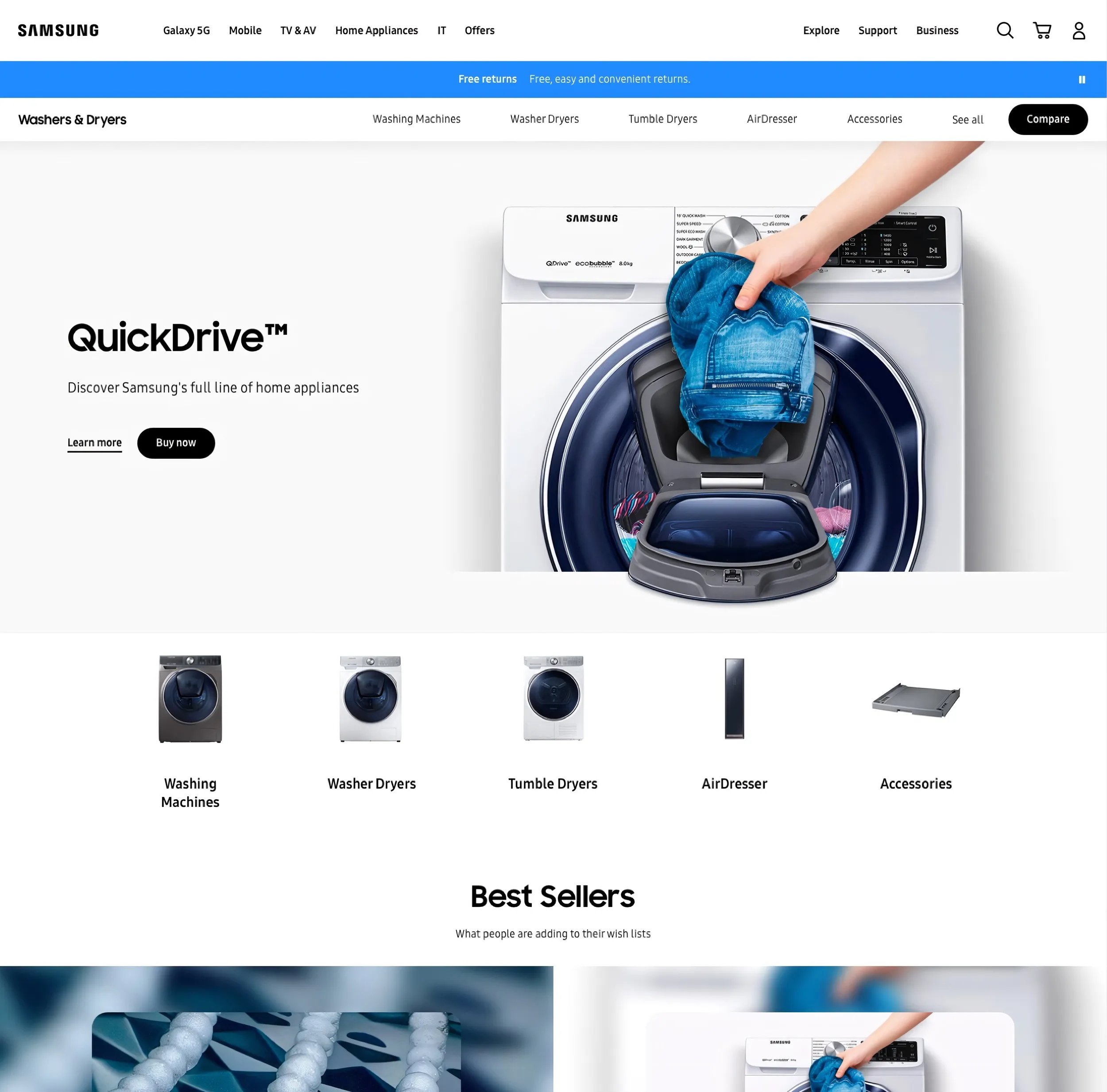
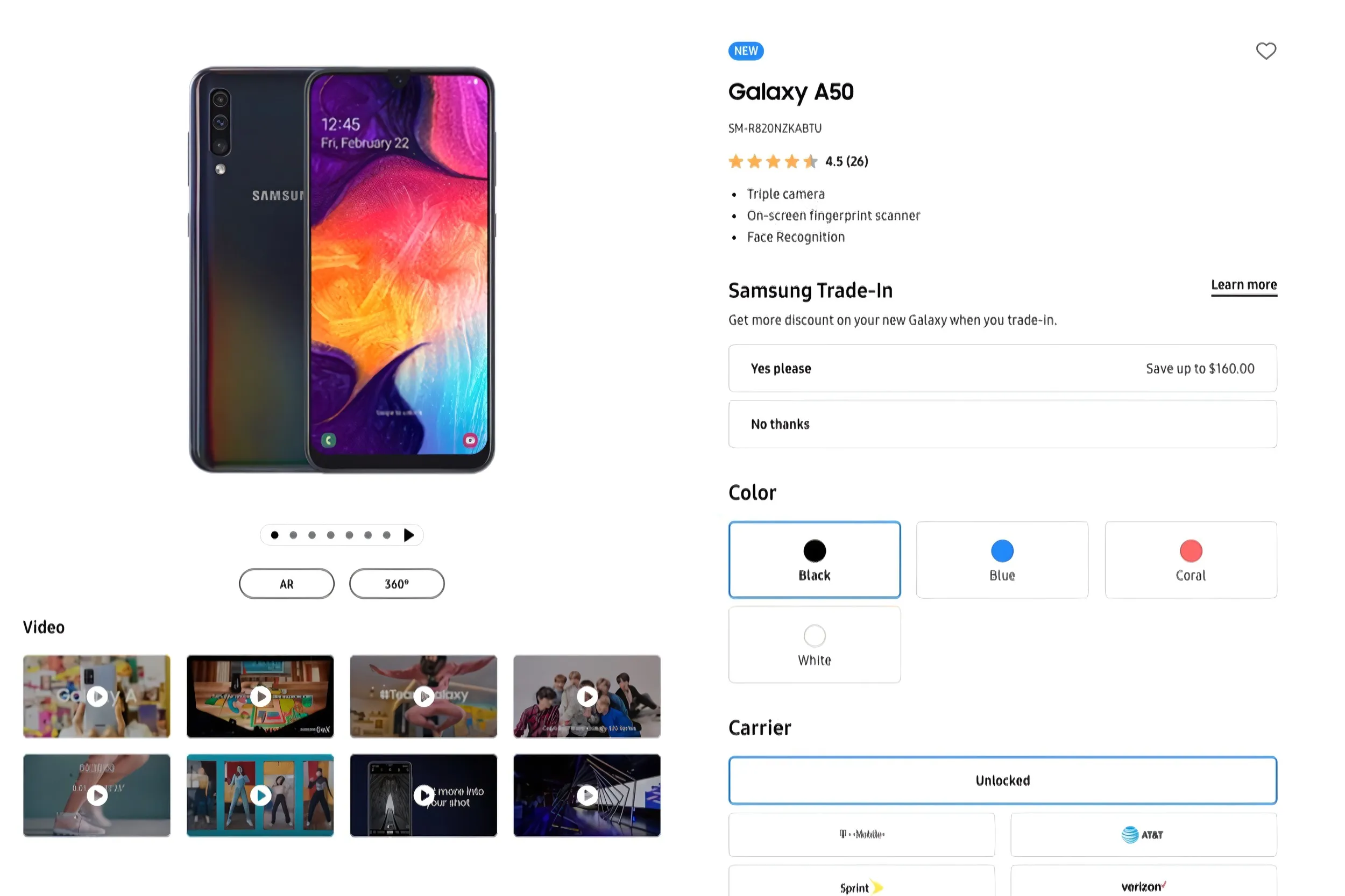
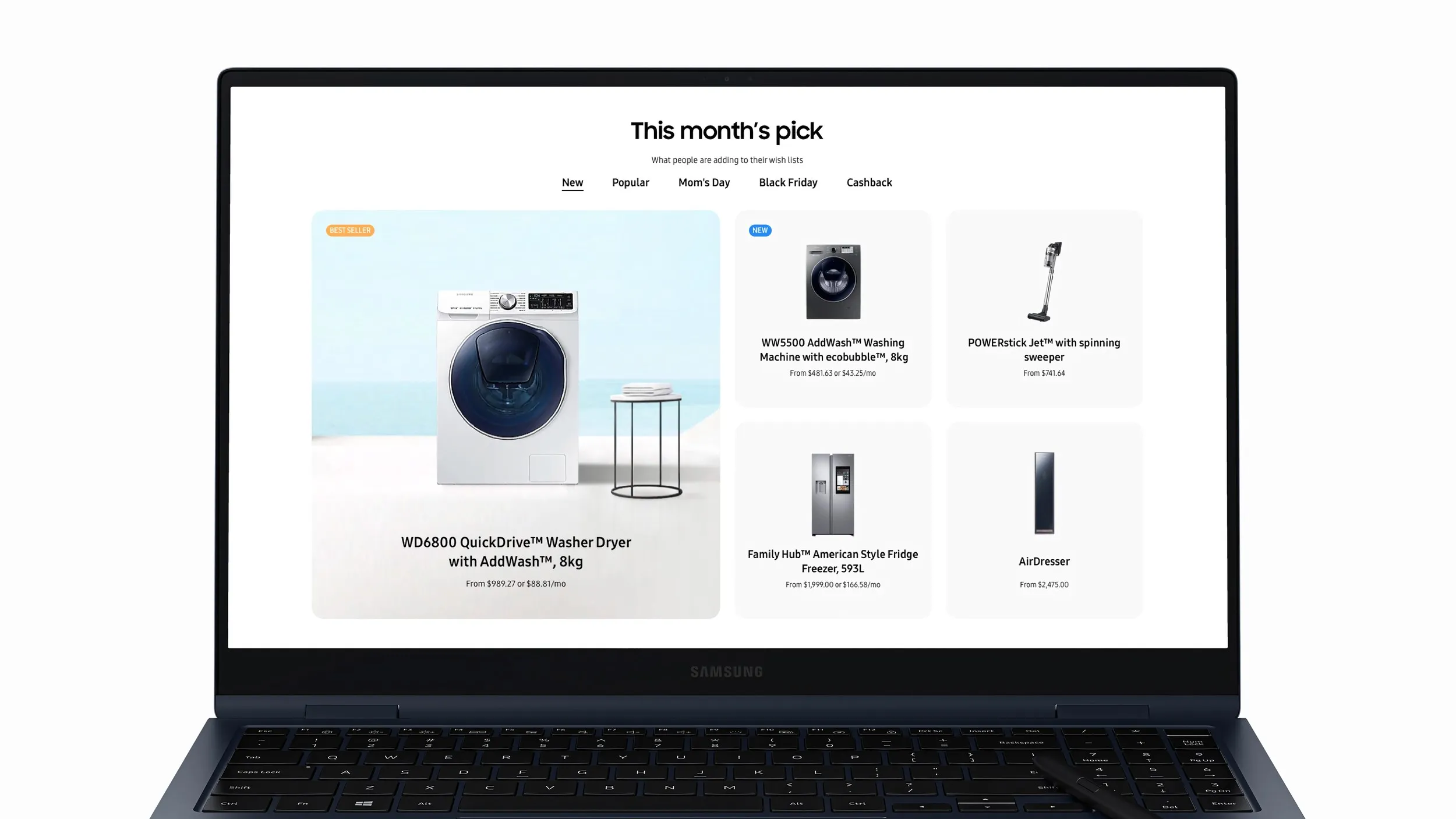
Page Layouts
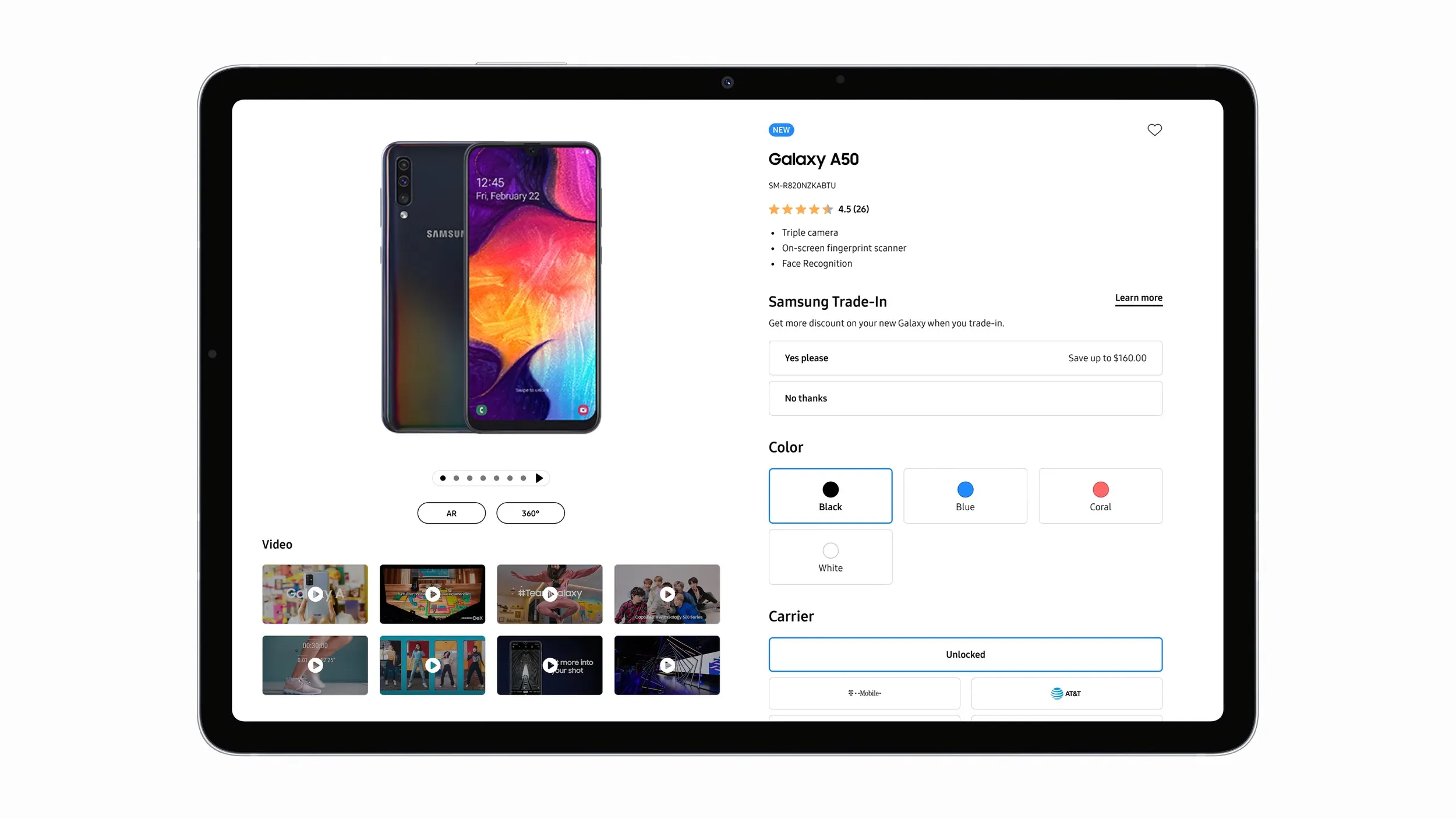
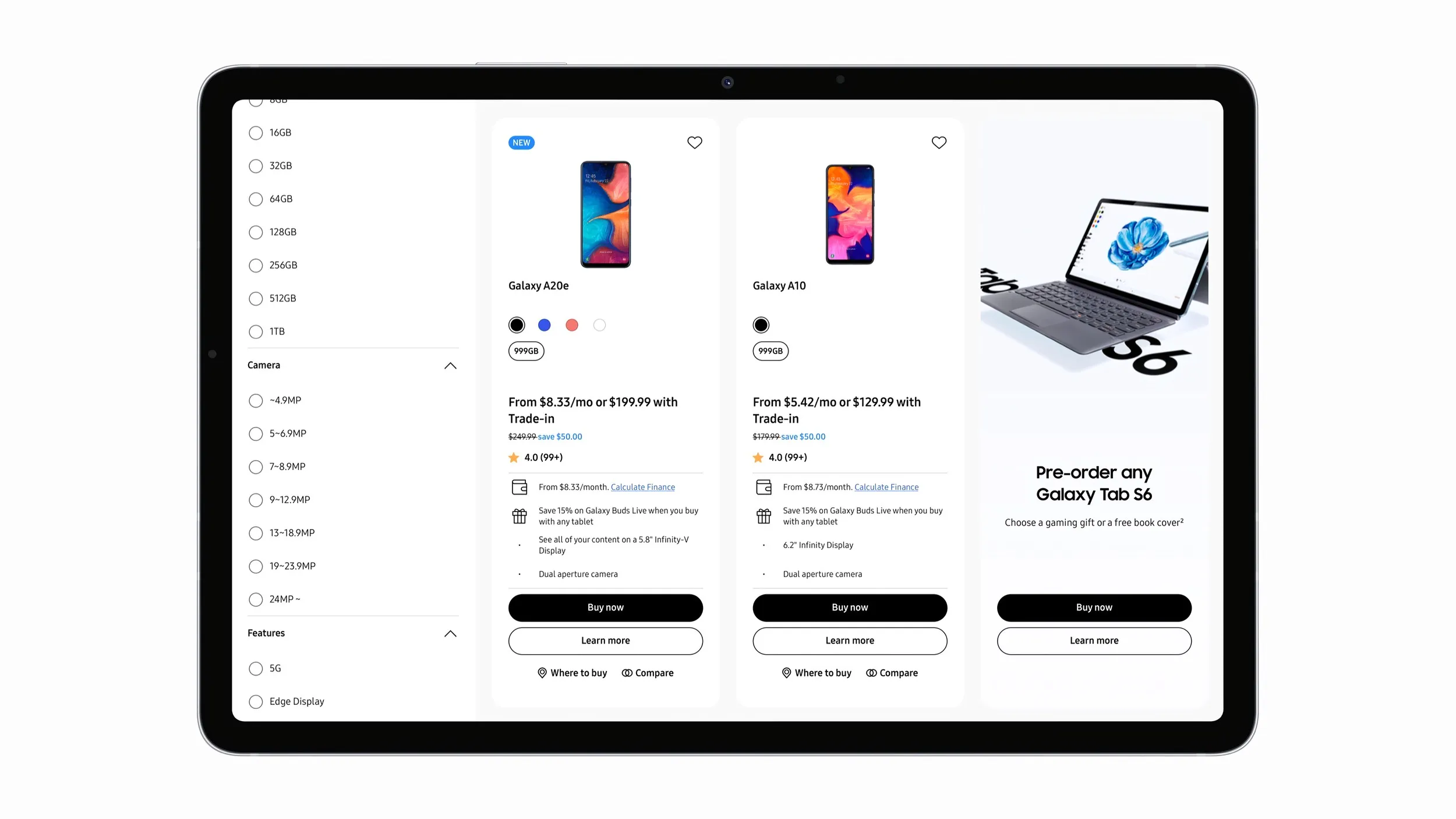
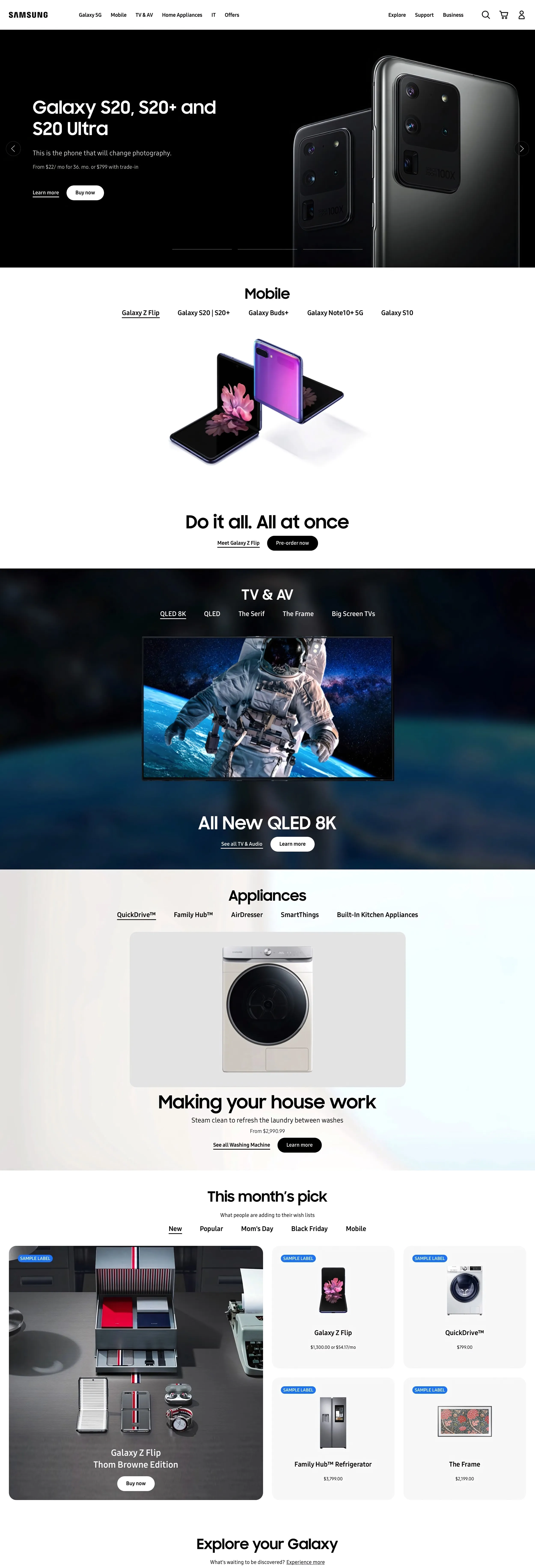
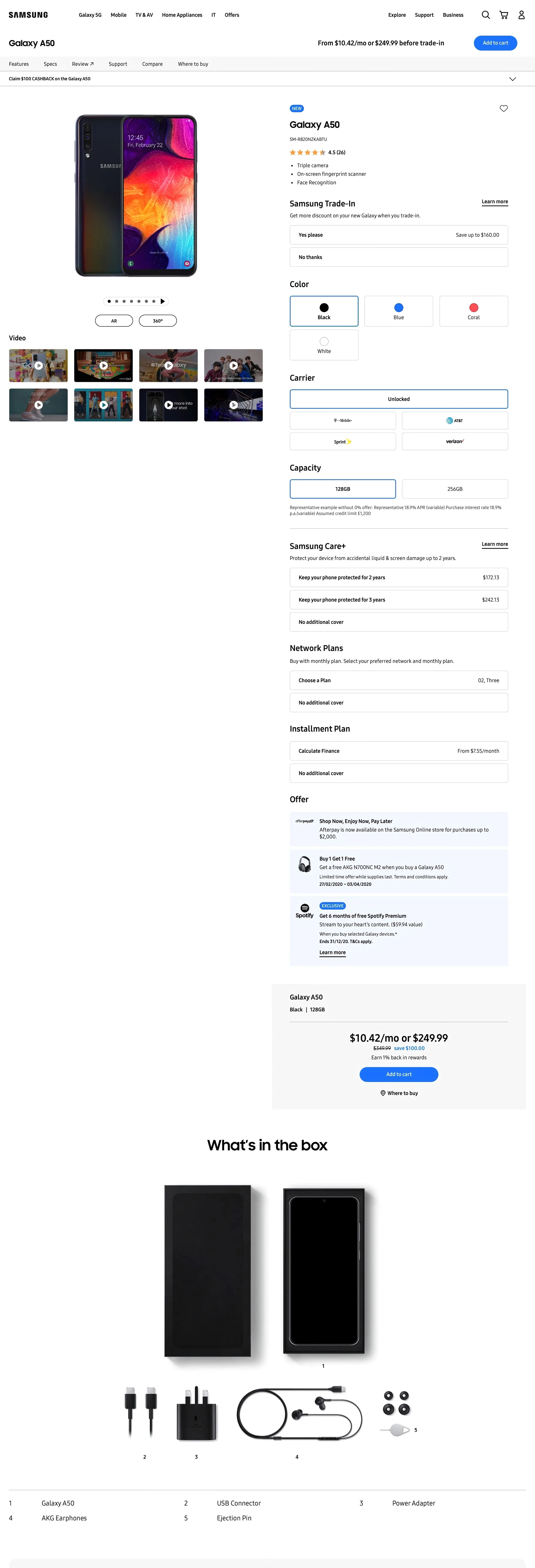
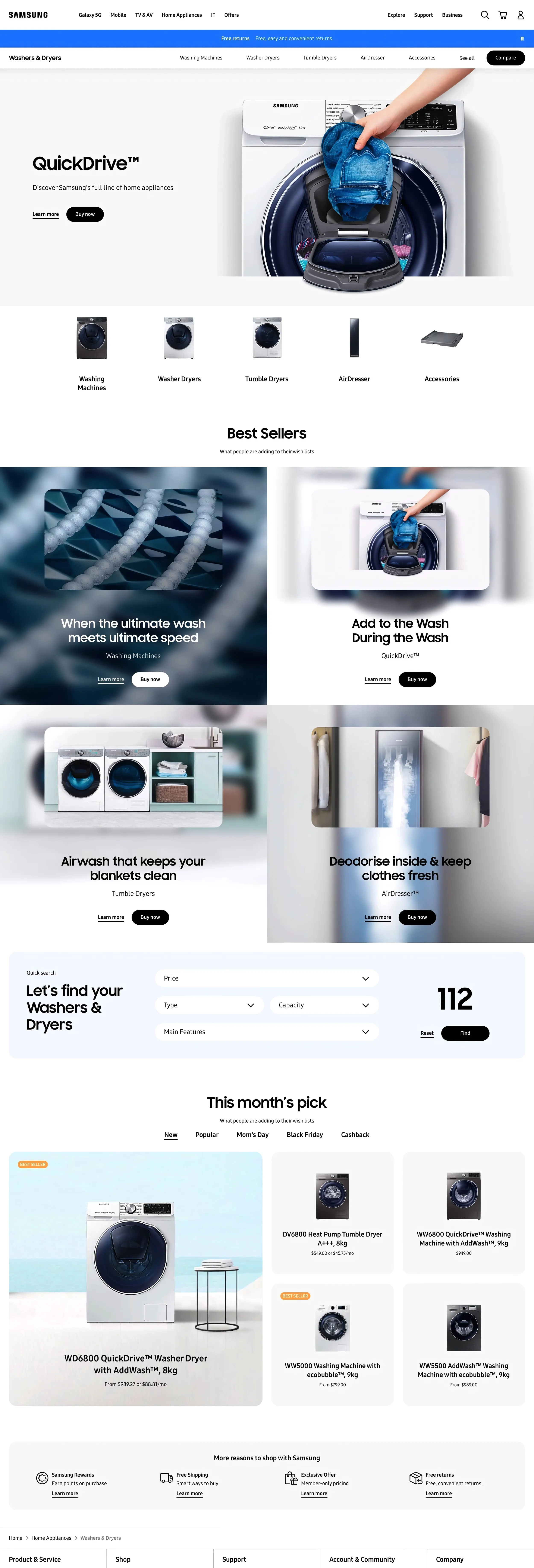
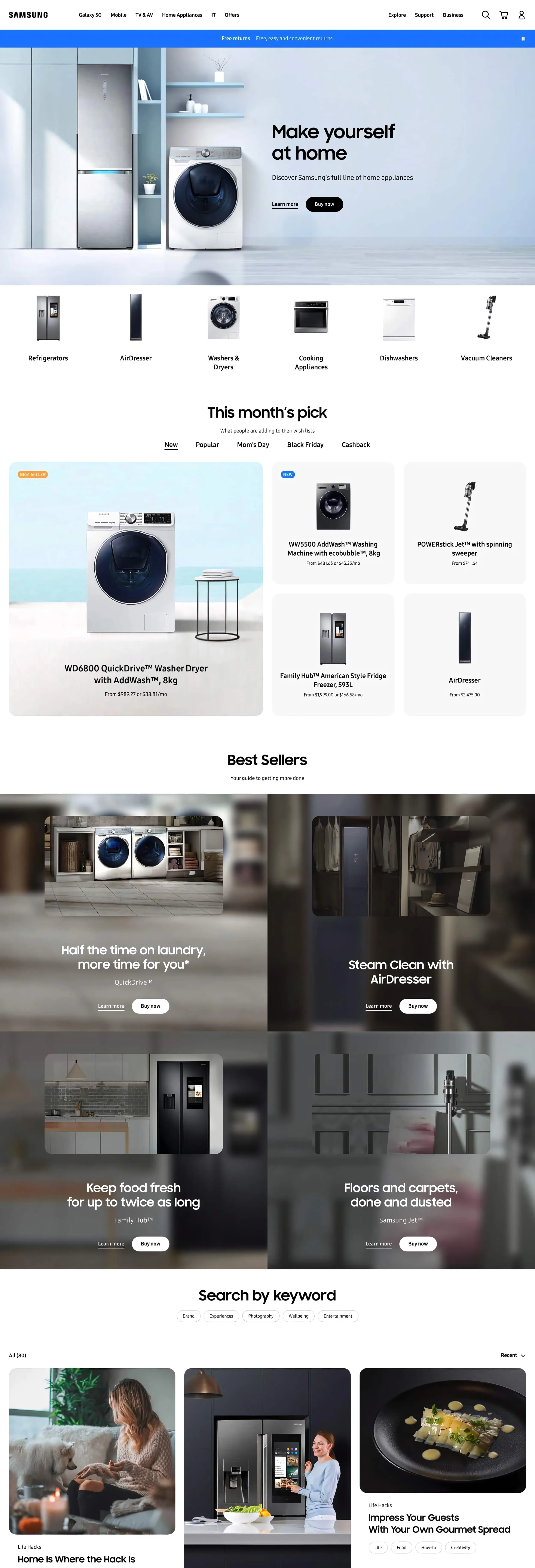
I designed page layouts across Samsung.com’s core page types: homepage, product detail, product category, and product family. Each had to work within Samsung’s rigid brand guidelines while serving its specific user intent. The homepage drove discovery, product pages drove purchase confidence, and category pages needed to handle wildly different catalog sizes per market.
Outcomes
Over six months, I delivered the global navigation’s visual direction, prototypes stress-tested against right-to-left scripts and deep catalogs, layouts for four core page types (homepage, product detail, category, and family), and components for the shared design system.
What I Learned
The GNB problem was information architecture before it was visual design. Designing for the hardest case first forced decisions about hierarchy, truncation, and overflow that a single-locale design would never surface. Starting with the most complex market’s catalog depth and script direction as the baseline meant every edge case was handled by default. At global scale, the job is writing constraints regional teams can work within.