Client / CVS
Role / Associate Design Director
Agency / Razorfish
Year / 2023
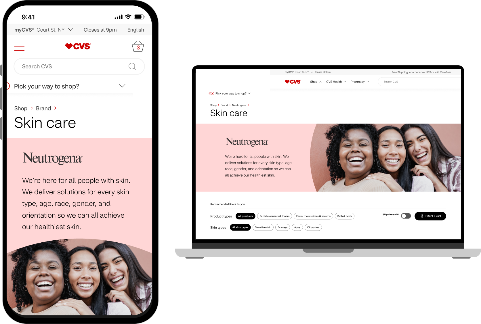
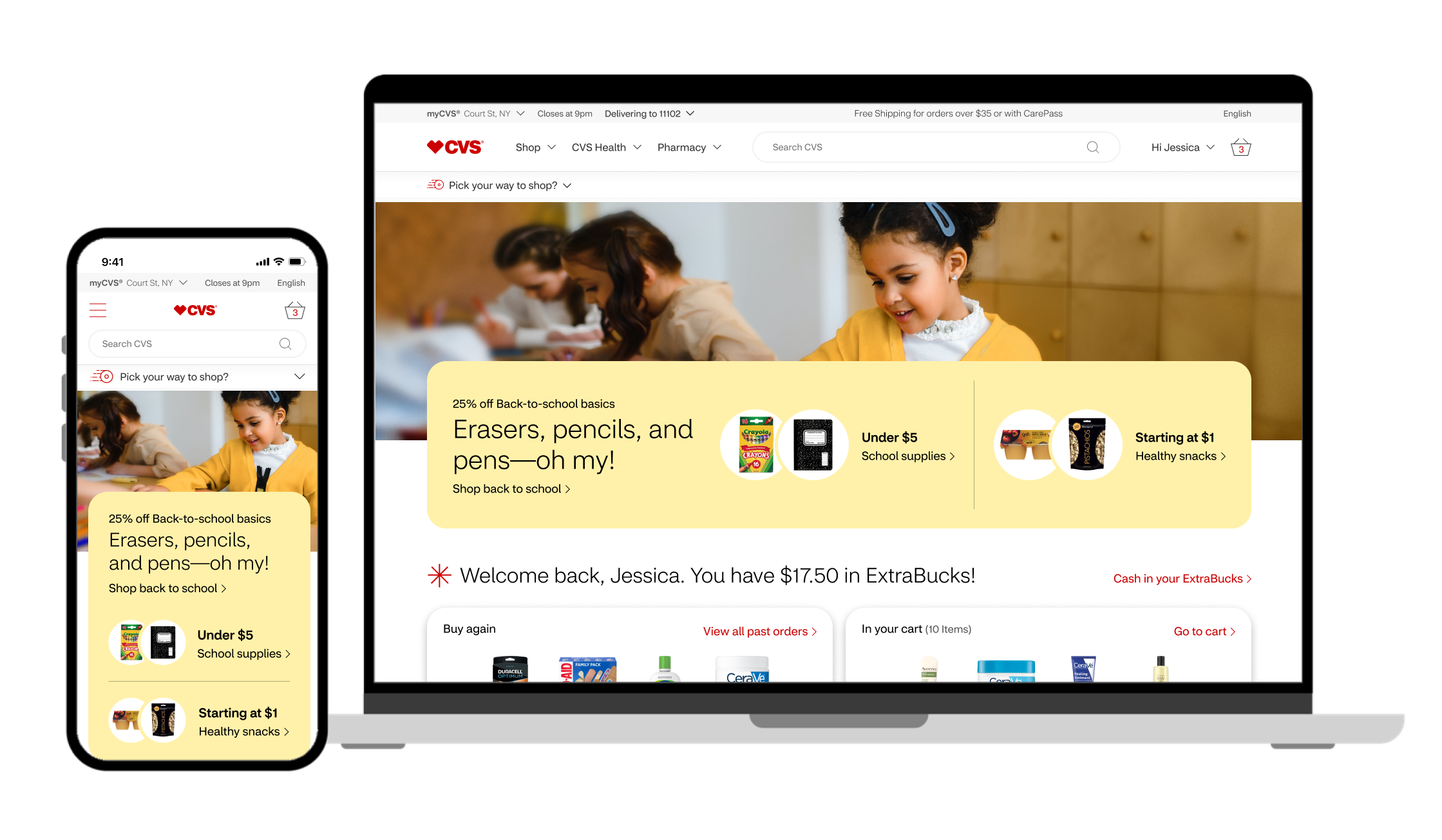
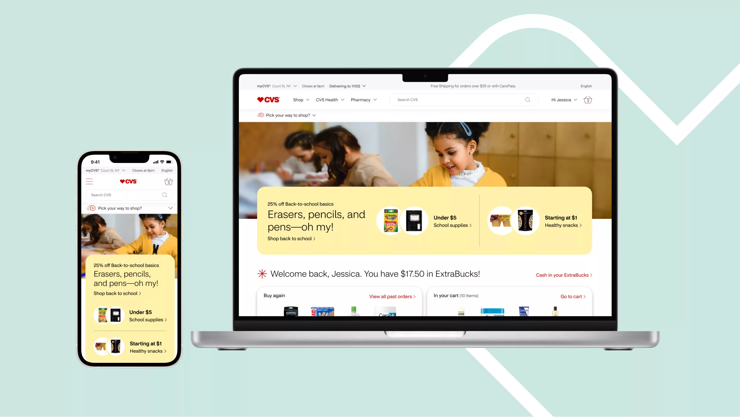
The CVS online shop needed an update to meet evolving consumer expectations and make the shopping experience more user-friendly. Our solution was to modernize the site by enhancing its visual appeal and simplifying navigation. We focused on creating a more intuitive and engaging platform that better reflected CVS’s commitment to health and wellness.
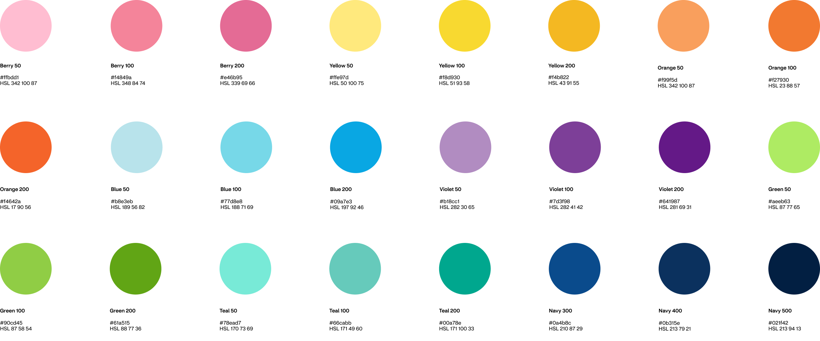
As Principal Designer, I played a key role in this transformation. I refined the typography for better readability, designed easy-to-navigate icons, and developed adaptable components to ensure a cohesive, modern look across the site. These contributions helped make the shopping experience more intuitive and visually appealing, improving overall customer satisfaction.
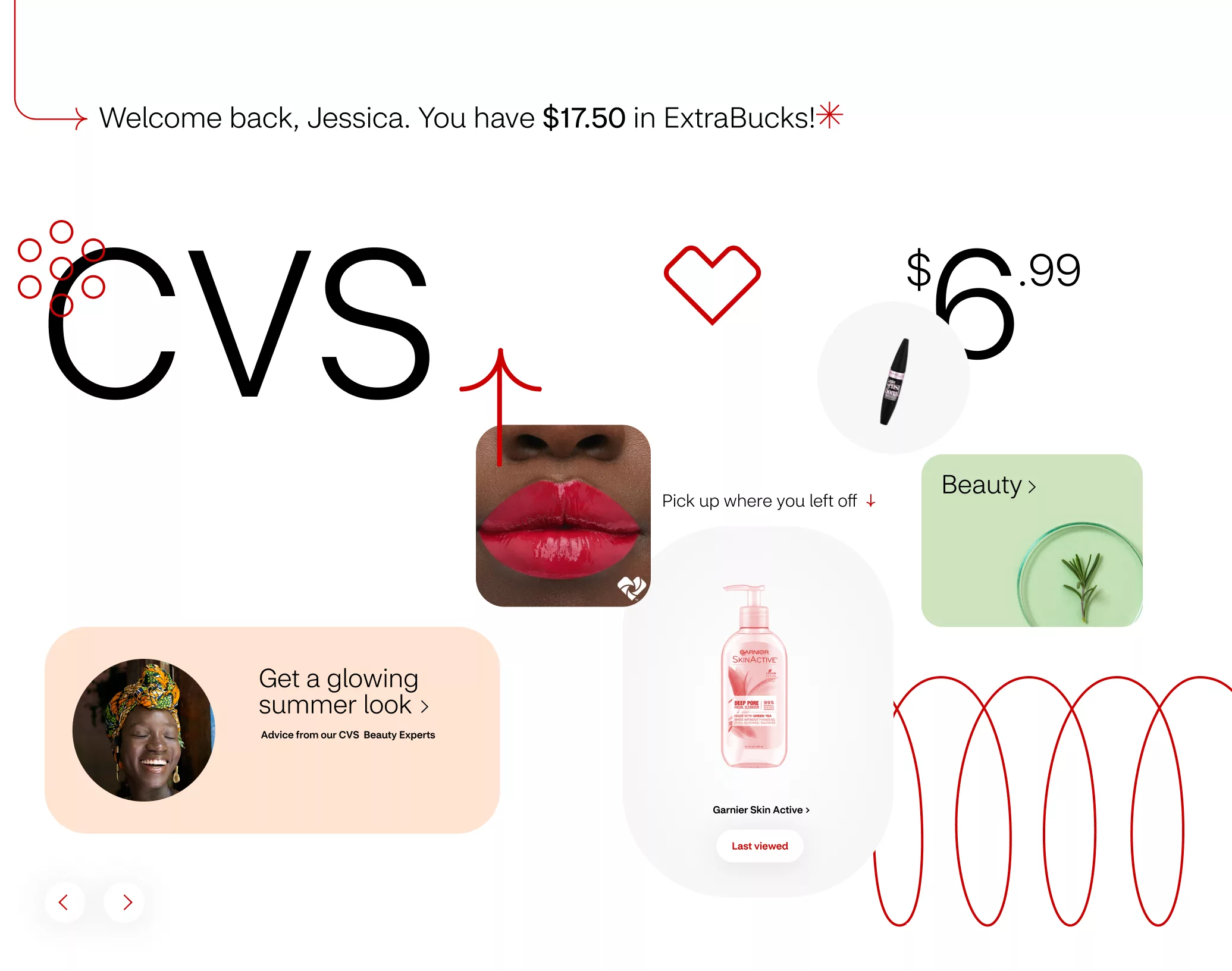
I refined the typographic hierarchy and system across CVS's digital platforms, enhancing user interface readability. By introducing CVS Health Sans light variant for headlines, I aimed to create a lighter and more inviting aesthetic. This careful balance of font weights and sizes contributed to a cohesive and accessible environment, improving the site's readability and visual harmony.
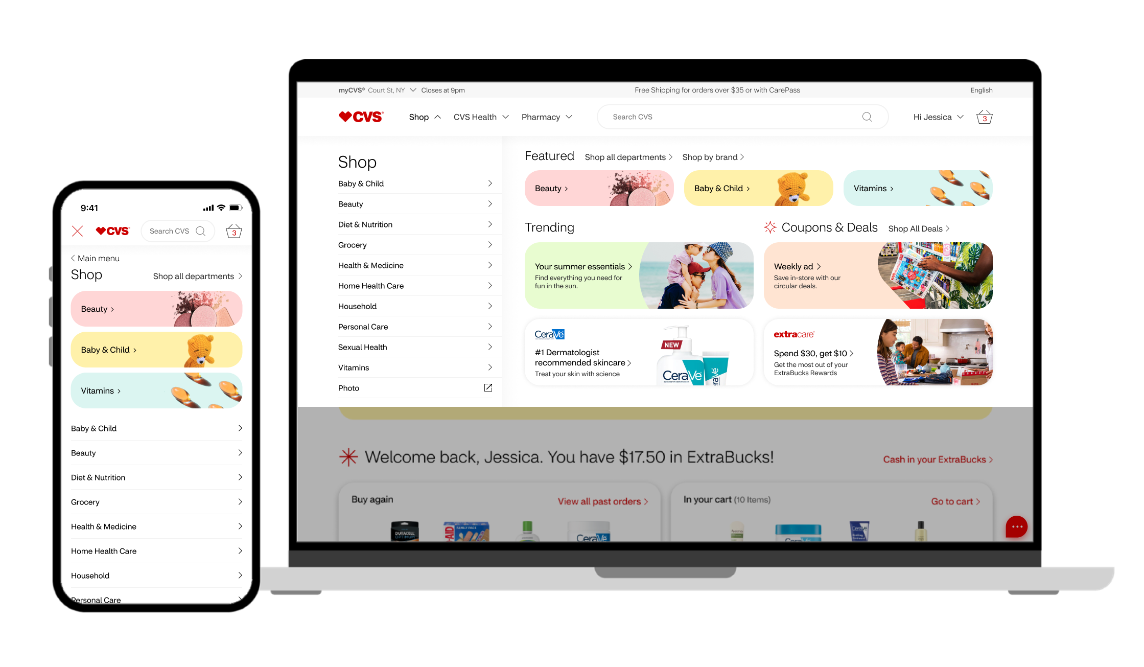
I enhanced the search and navigation features to make the user journey more intuitive and personalized, including smart auto-suggestions and streamlined page transitions. This improved the shopping experience, making it more efficient and user-centric.
The CVS Shop homepage redesign centered on creating an inviting and user-friendly entry point, emphasizing personalized content and easy navigation to enhance the shopping experience. The goal was to make the homepage a welcoming portal for both new and returning customers, ensuring an immediate, positive engagement with the CVS brand.
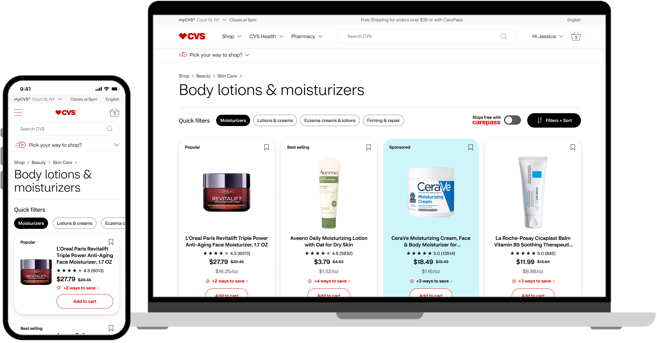
I contributed significantly by designing and delivering product card components for the product listing page, focusing on clarity, user-friendliness, and aesthetic appeal. These cards effectively balanced detailed product information with a clean design, employing principles like hierarchy and contrast to highlight key details such as price, reviews, and availability.
Glad you stopped by. Let’s connect.