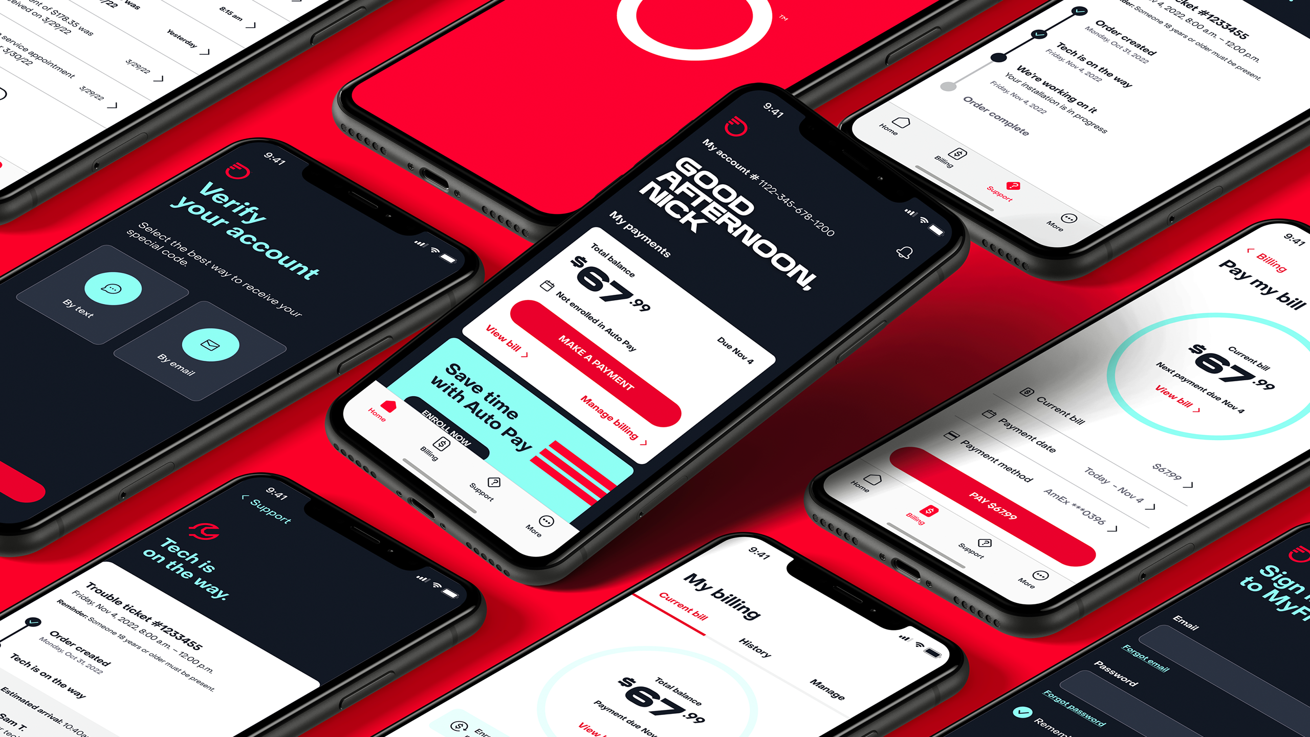
MyFrontier App
Streamlined design, effortless interaction.
Client / Frontier
Role / Associate Design Director
Agency / Razorfish
Year / 2023
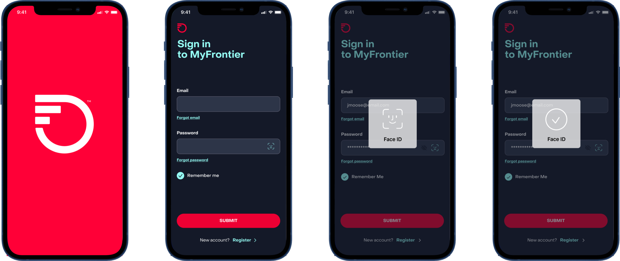
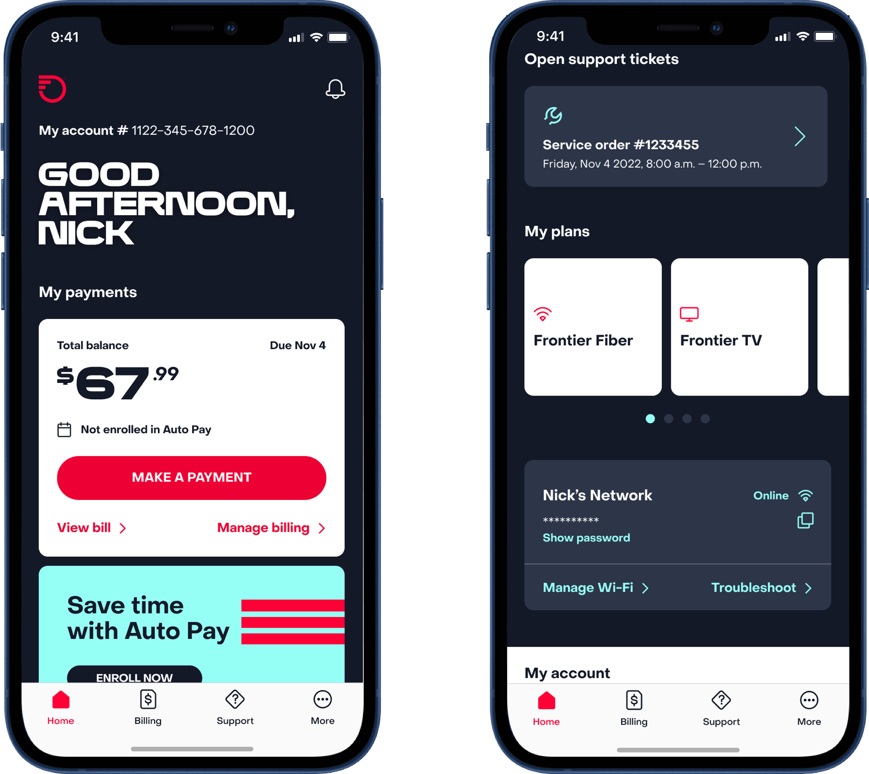
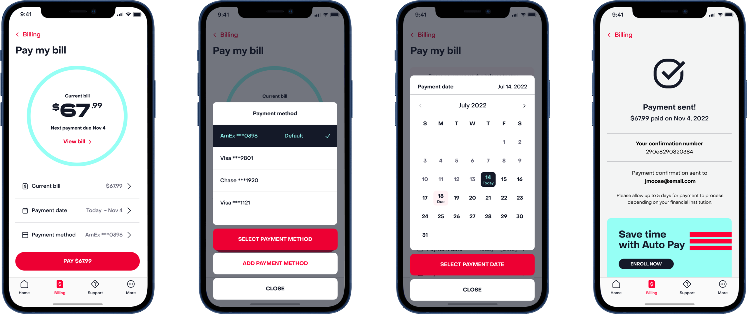
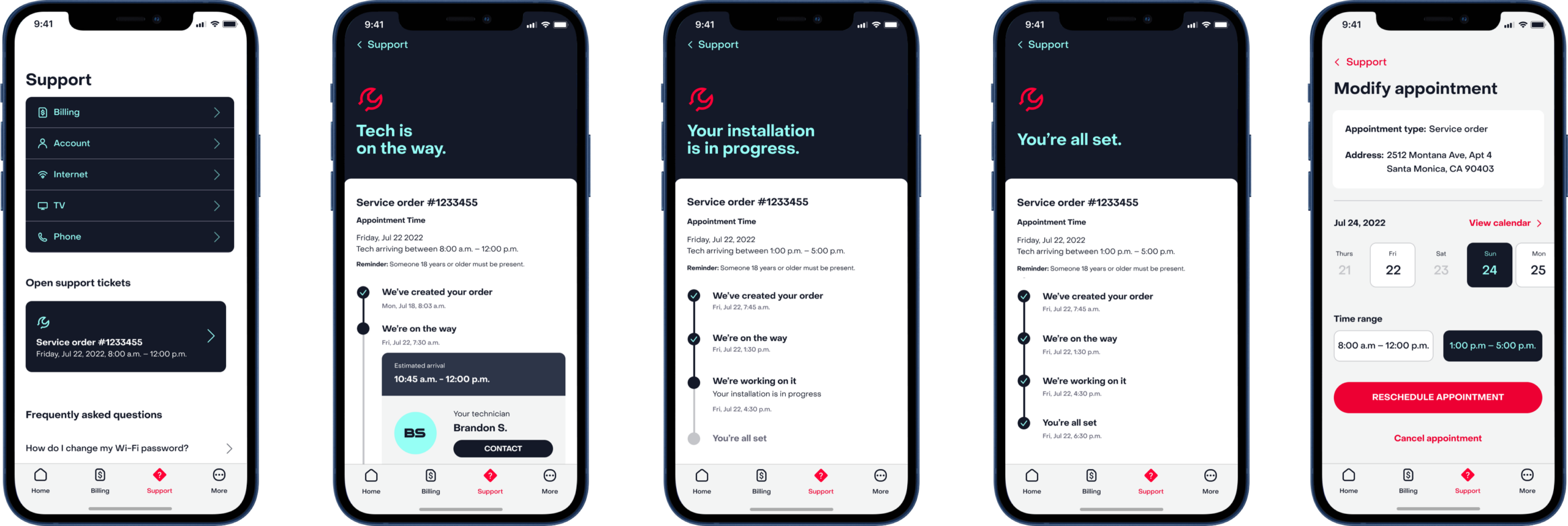
The MyFrontier app was overdue for a refresh to enhance user satisfaction. We simplified the interface, improved navigation, and added motion design to create a more user-friendly experience. These updates made the app not only easier to use but also aligned it with the brand’s new modern image.
As Principal Designer, I led the redesign, ensuring the app was intuitive and visually appealing. From the revamped login process to the streamlined features, the changes made the app more enjoyable to use and better reflected Frontier’s updated brand identity.
Glad you stopped by. Let’s connect.