
2022
All workCVS.com E-commerce Design System
Type system, icon grid, and component library for CVS.com's e-commerce platform.
I led the design system behind CVS.com’s shop redesign: one type scale, one icon grid, and a component library covering home, category, brand, and product pages. Five designers had three months, on a live site that couldn’t be redesigned from scratch. I set the design direction and built composable parts instead of page-specific components, so teams could assemble what they needed.
The Problem
CVS sits at an unusual intersection: pharmacy and general retailer. That means the platform serves a wider range of intent than most e-commerce sites. Over time, the shop grew through acquisitions rather than deliberate system thinking, producing fractured type scales, inconsistent icons, and components built independently rather than from shared parts. Because CVS.com is a live platform with real customer volume, I couldn’t start over. I had to build shared parts that made every downstream page more consistent without breaking what was live.

Type and Icons First
Instead of designing a “homepage hero” or a “category card,” I started with the parts every page shares. I built a type system on a rational scale, so every downstream component inherited consistency instead of engineering it in later. I drew every icon and illustration on one grid in CVS brand red, so a 16px icon and a 48px icon read as the same family, with no case-by-case adjustment.


Components & Templates
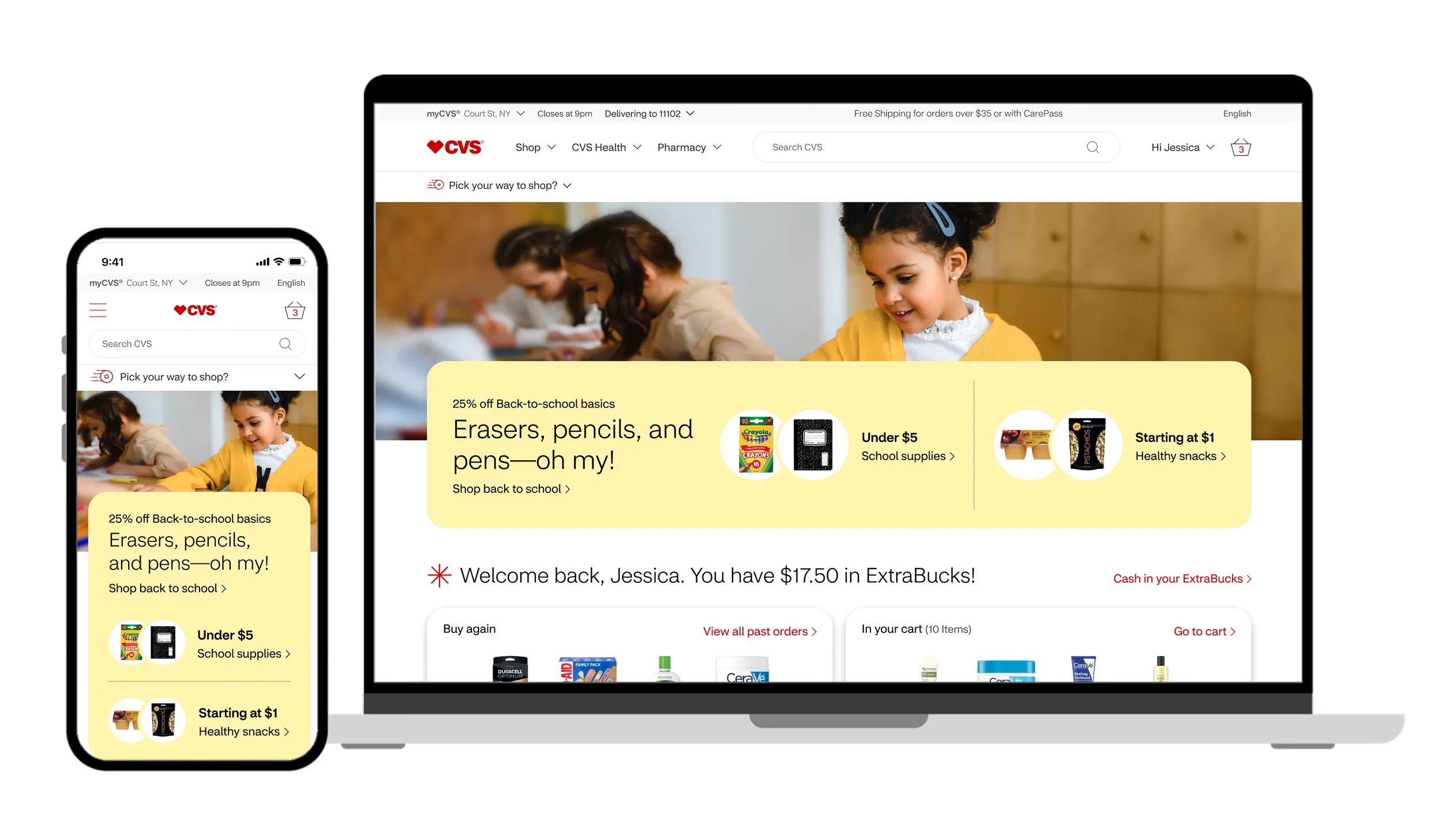
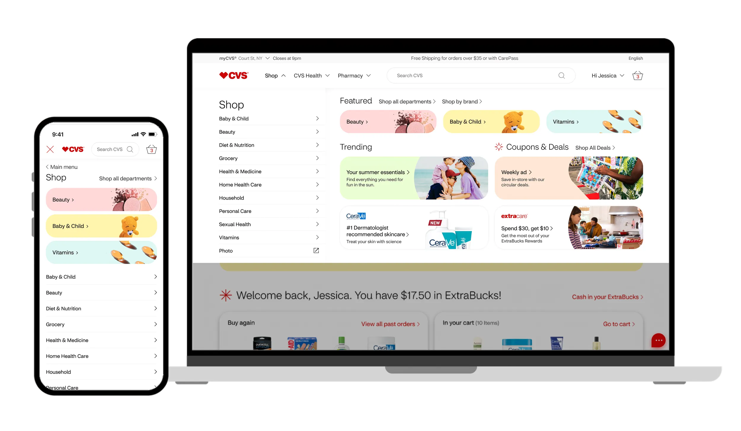
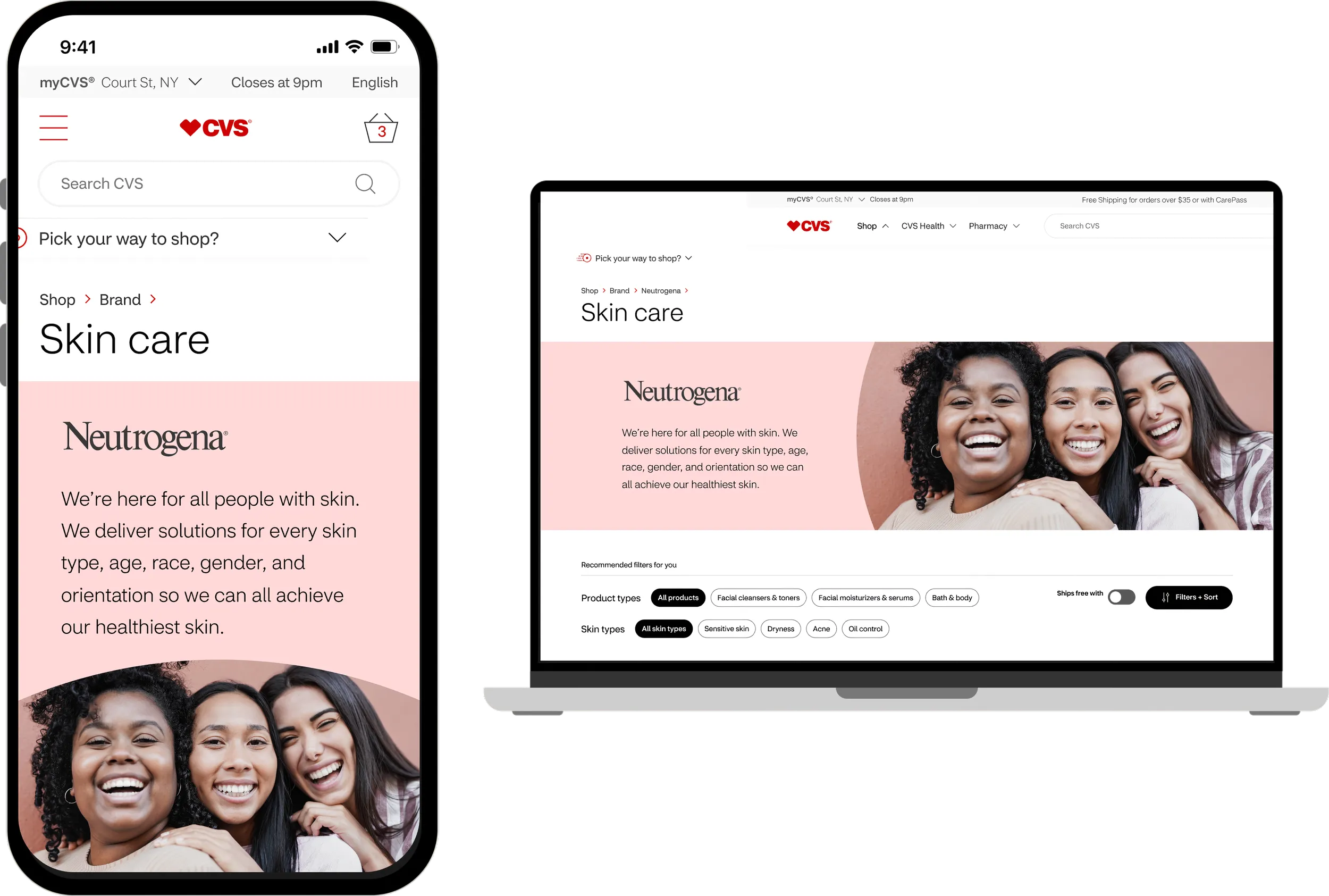
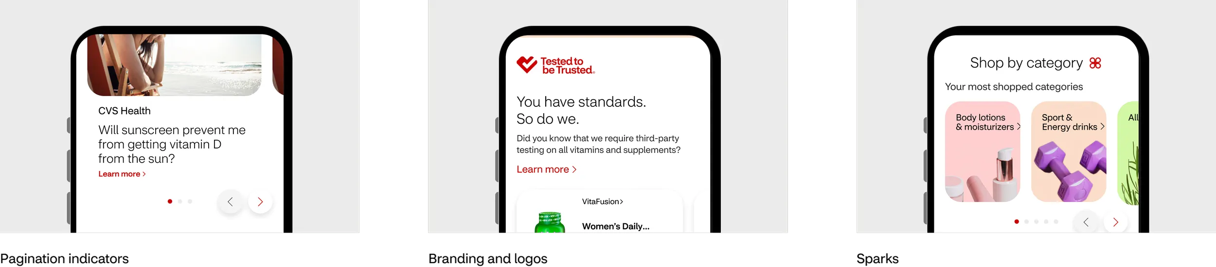
The component library covered homepage modules, product pages, and category navigation. I designed each piece for desktop and mobile from the start, instead of the usual desktop first and adapting after the fact.

Outcomes
In three months, the team delivered one type scale, one icon grid, and a component library covering home, category, brand, and product pages. New pages could be assembled from shared parts instead of built one component at a time.
What I Learned
The biggest lesson was restraint. On a live platform, the instinct is to redesign everything. Not breaking what shipped forced better thinking: build the smallest possible shared parts, and let consistency propagate through adoption rather than mandates. The teams that picked up the system fastest were the ones who felt the pain of the old fragmentation most. It removed decisions they were tired of making.