2022
All workMyFrontier App Redesign
Visual redesign and motion system for a telecom app people only open when something's wrong.
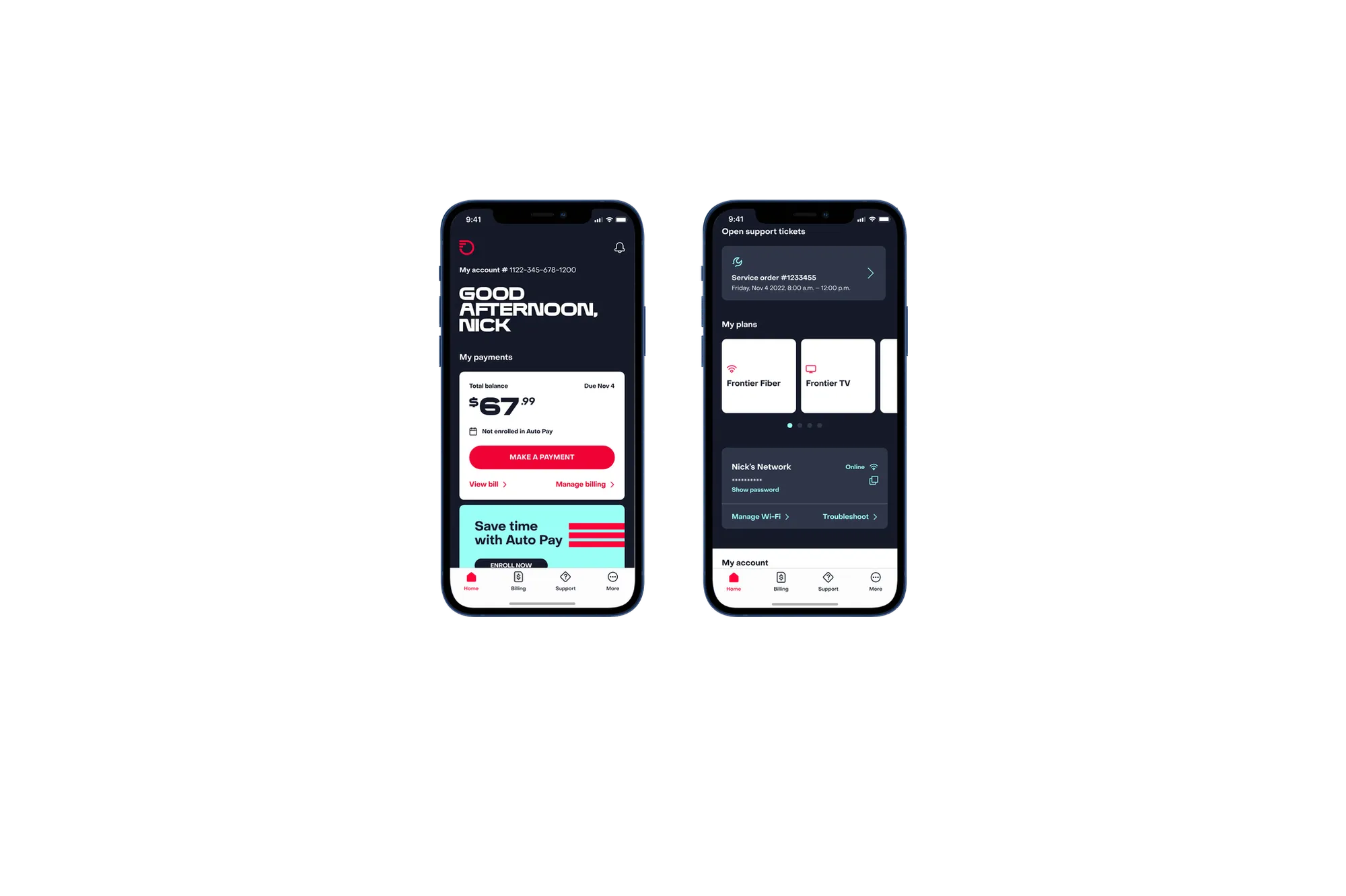
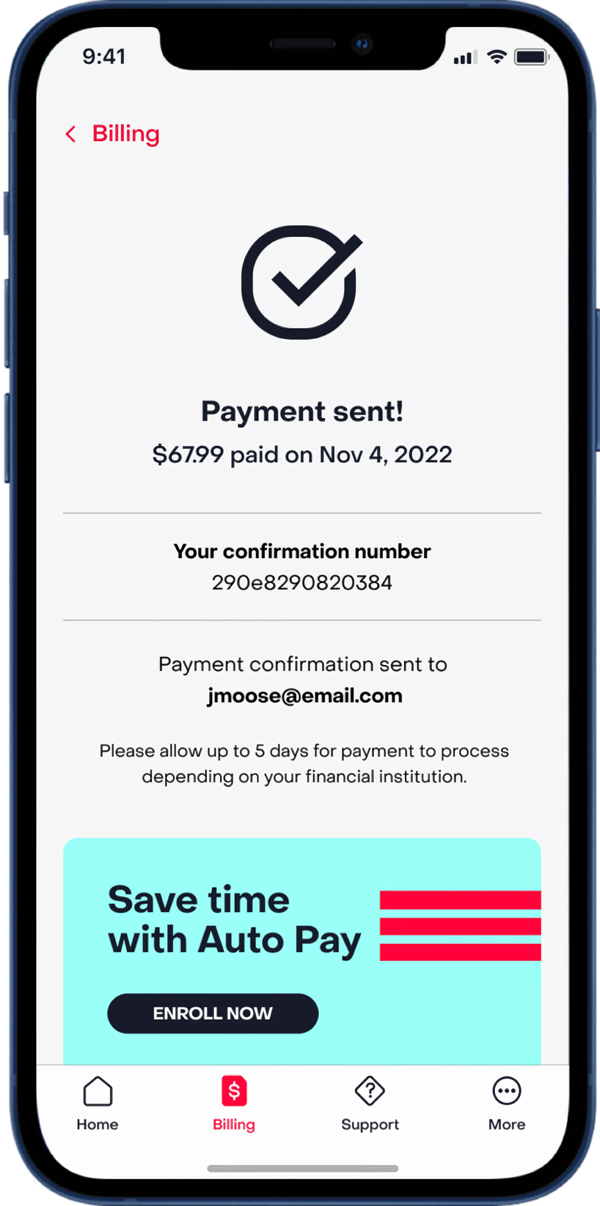
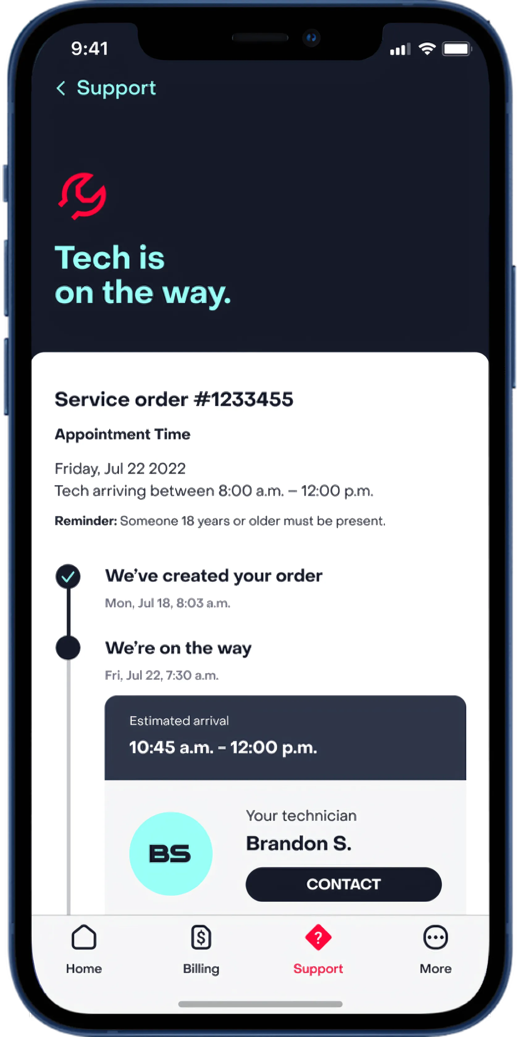
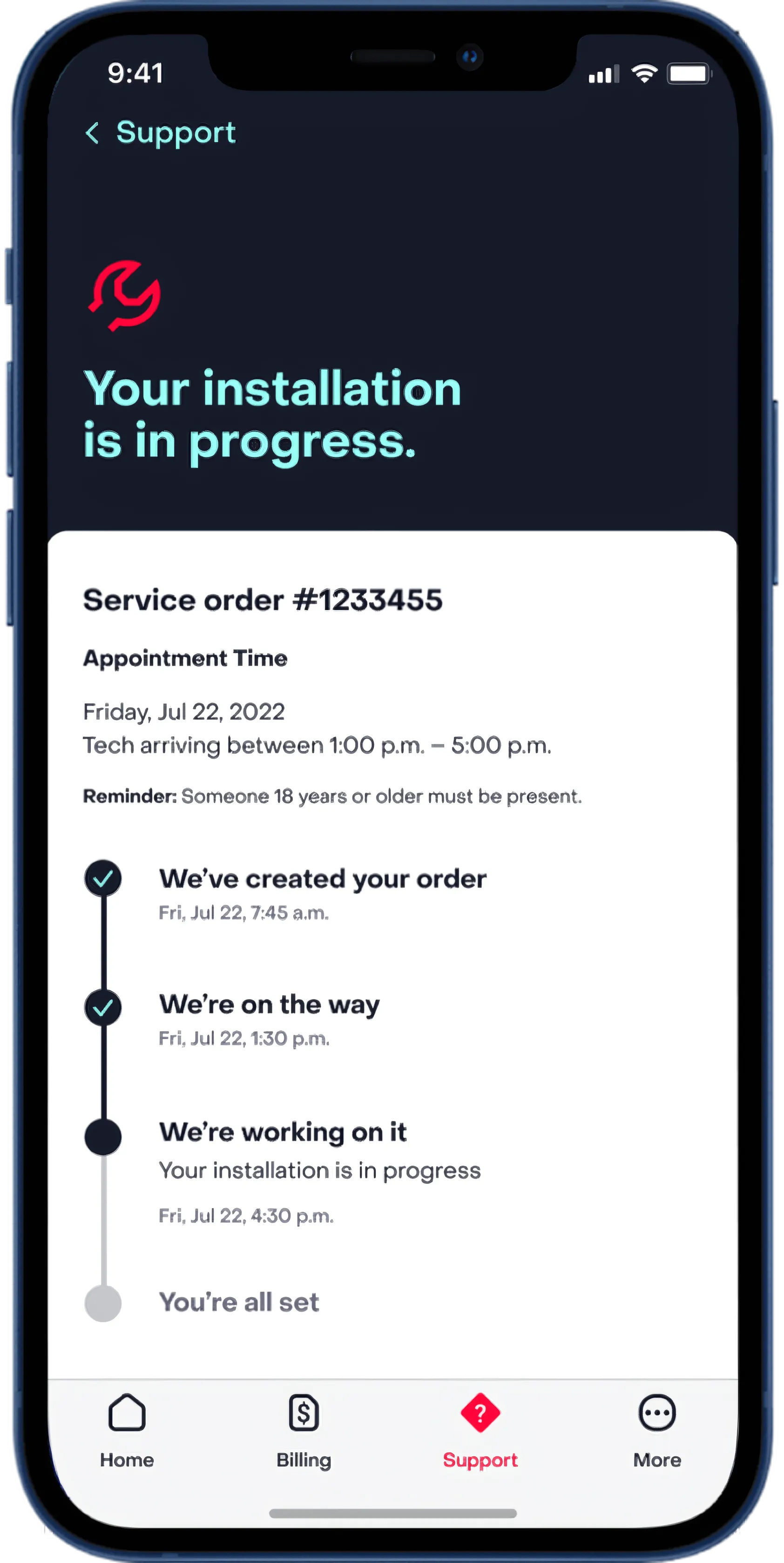
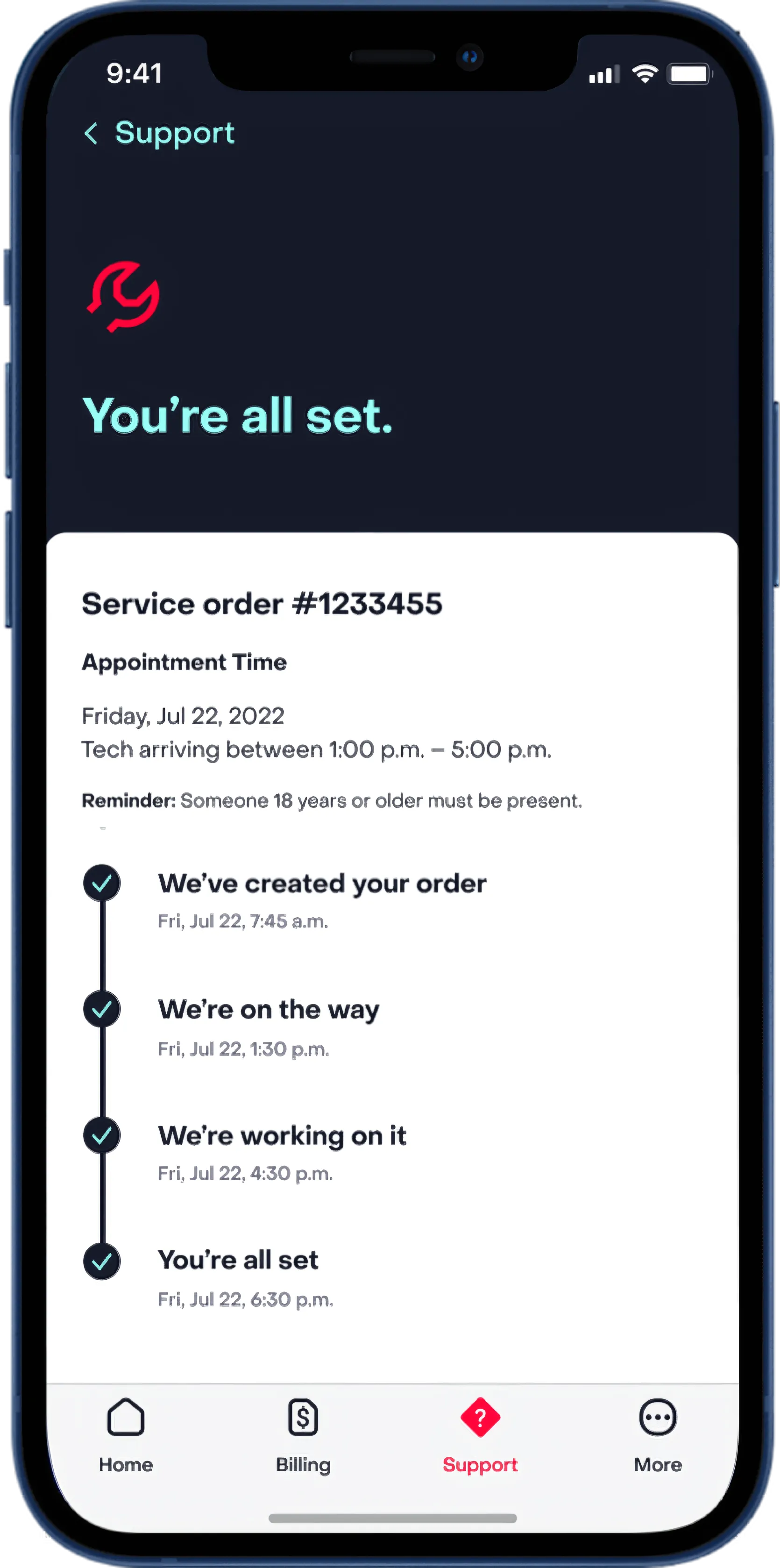
I rebuilt the MyFrontier app’s visual design and layout system, and built its motion language from scratch, as Associate Design Director on a four-designer team working close to dev for four months. The app covers bill pay, account management, technician scheduling, and support, but the experience didn’t hold together. Every animation I made answers a question the user is already asking: did my payment go through, is my appointment set, am I done?
The Problem
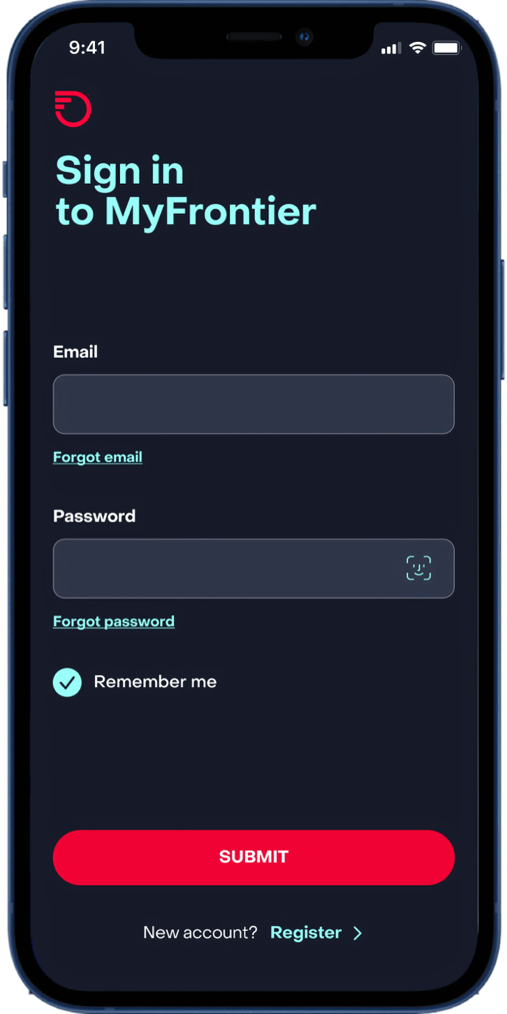
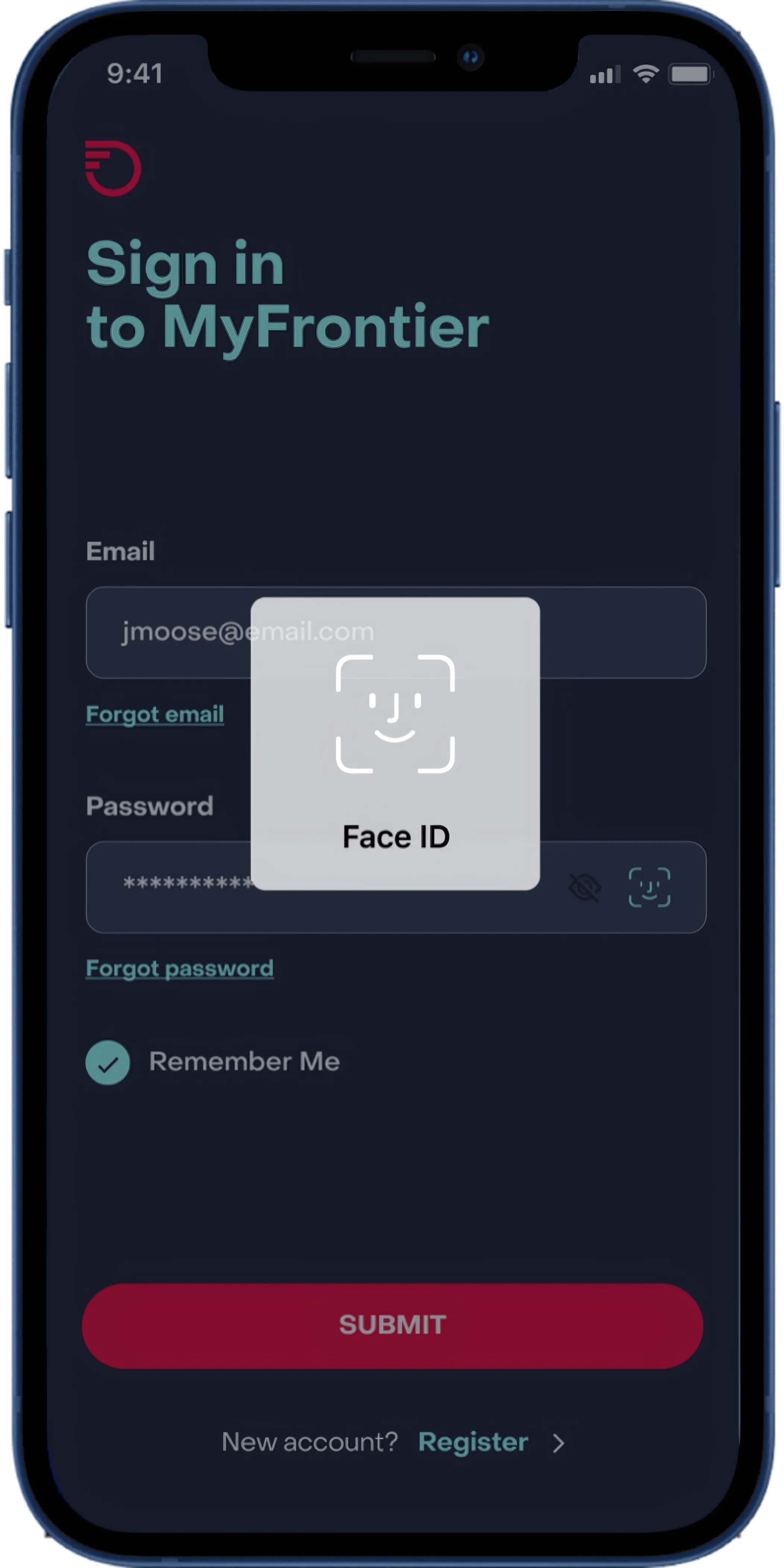
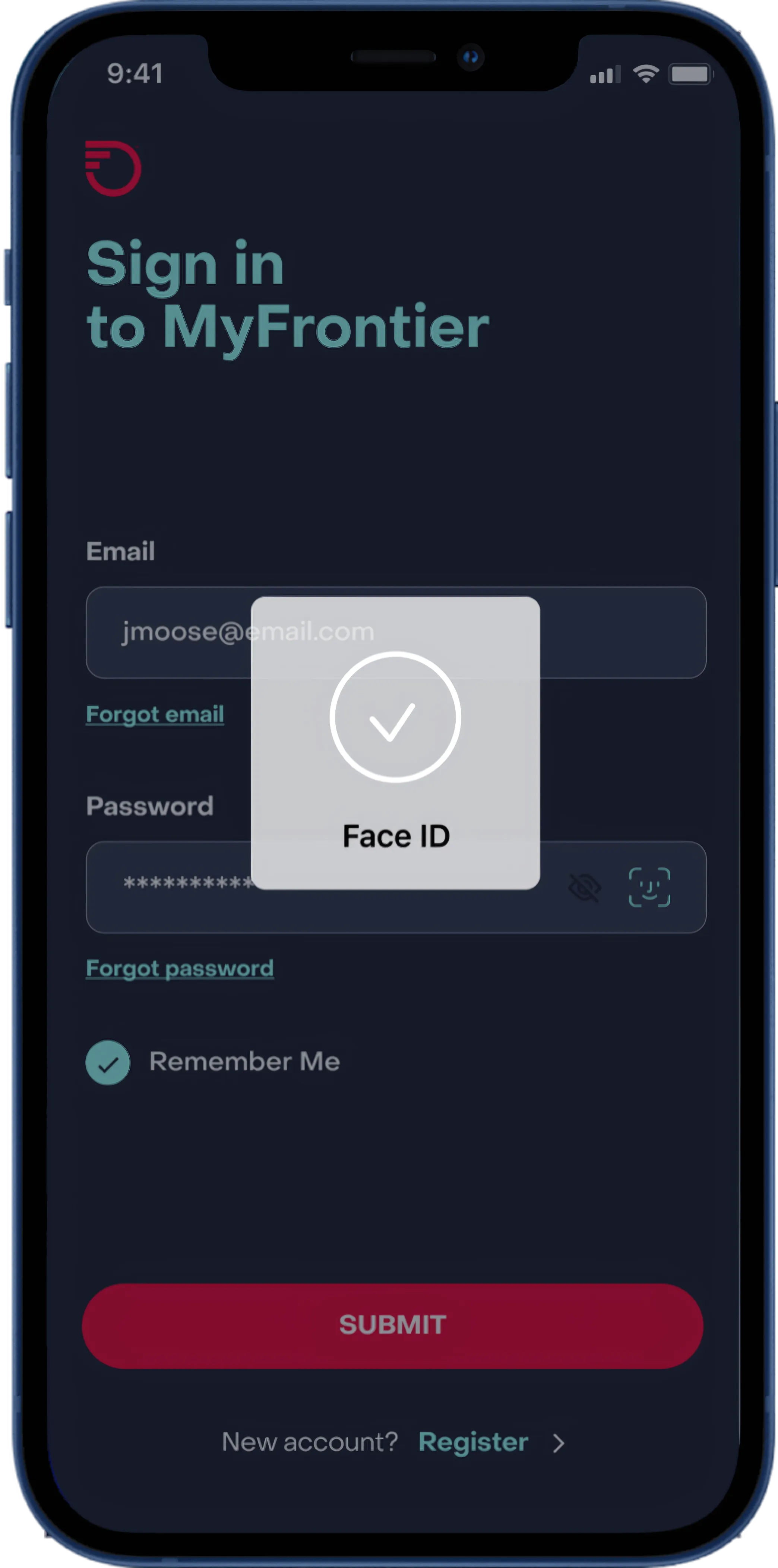
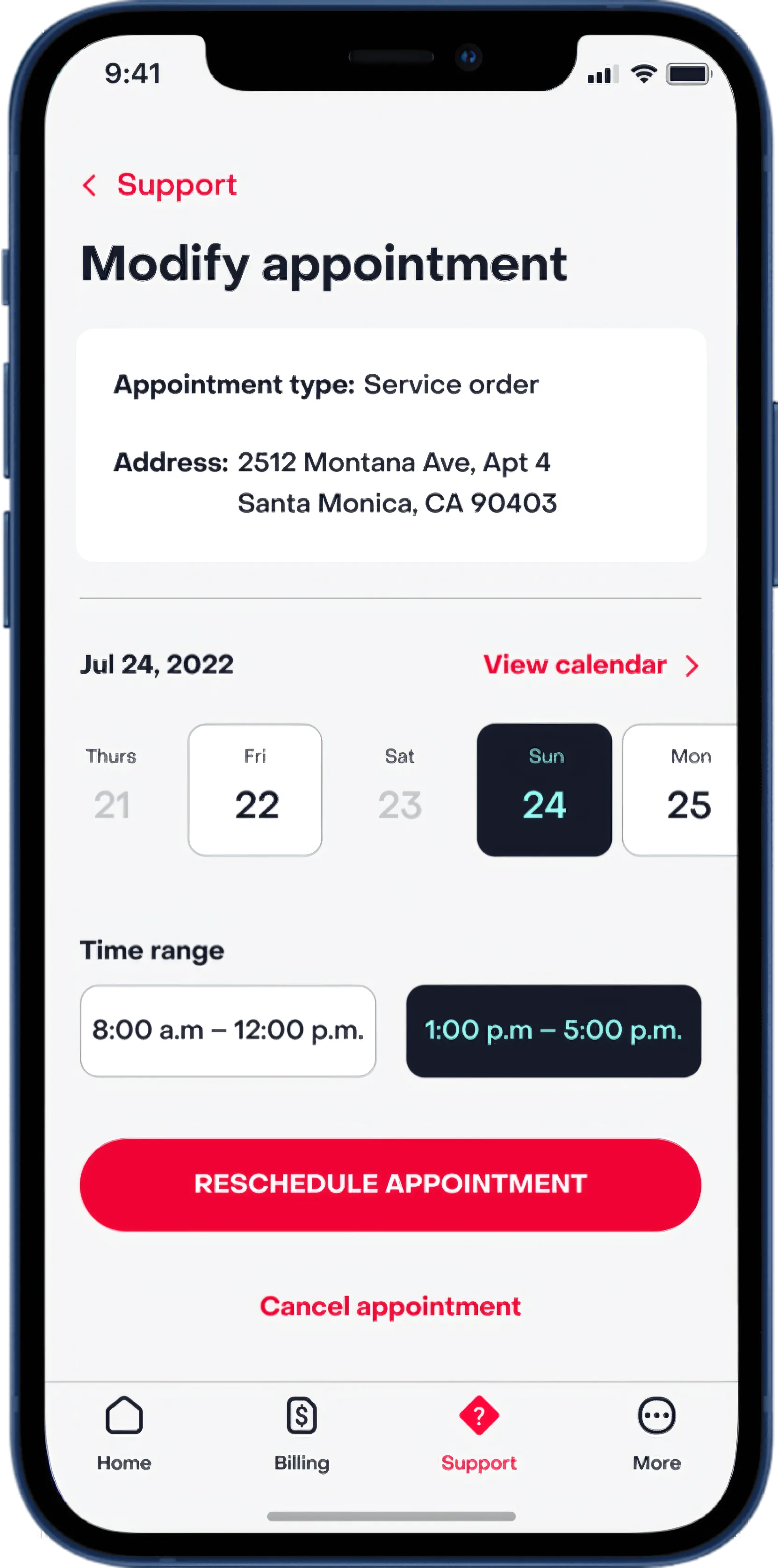
Nobody opens a telecom app to browse. They open it because they have a question about their bill, because a technician is coming and they need to confirm the window, or because their internet is down and they need answers fast. The MyFrontier app had accumulated inconsistencies across years: layouts that varied from flow to flow, controls that gave no feedback, and zero motion. Every fix had to respect those real-world stakes. People in a bad moment shouldn’t have to think about the interface.
One Layout System
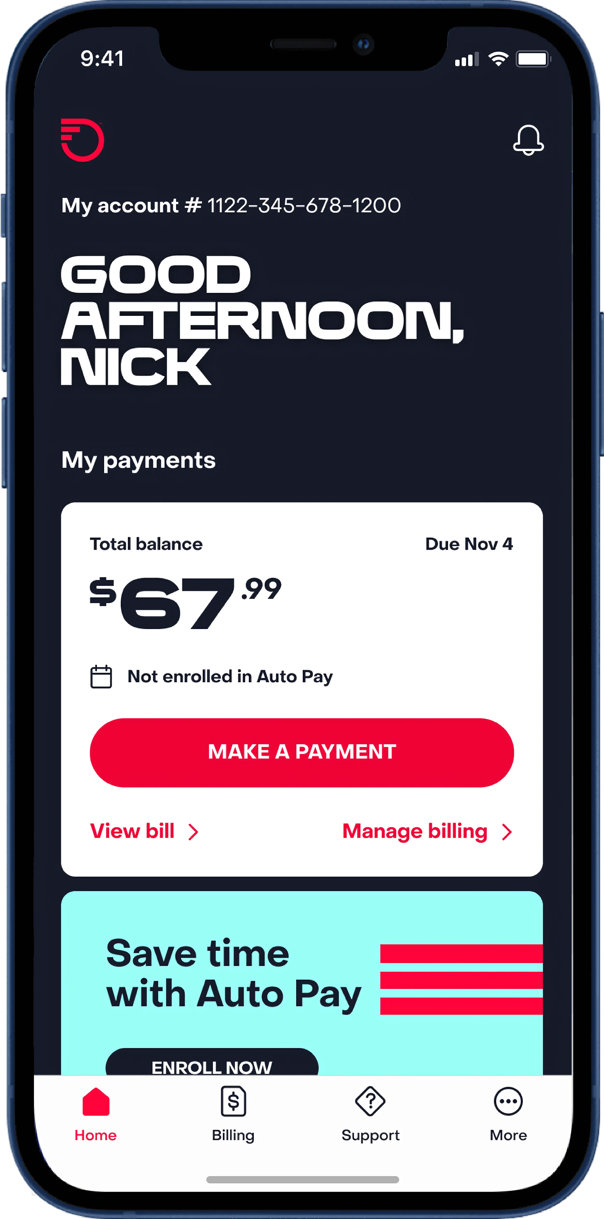
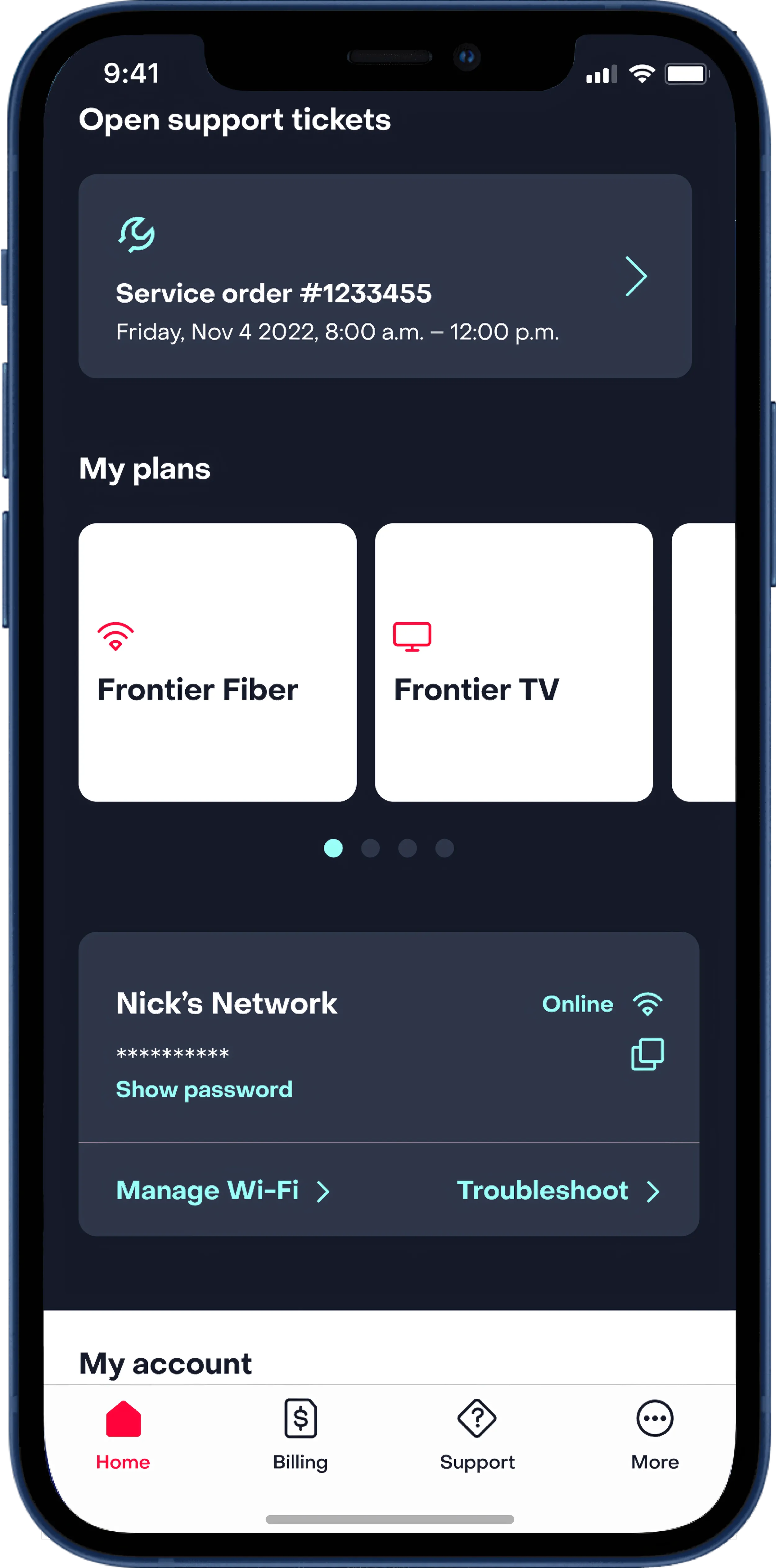
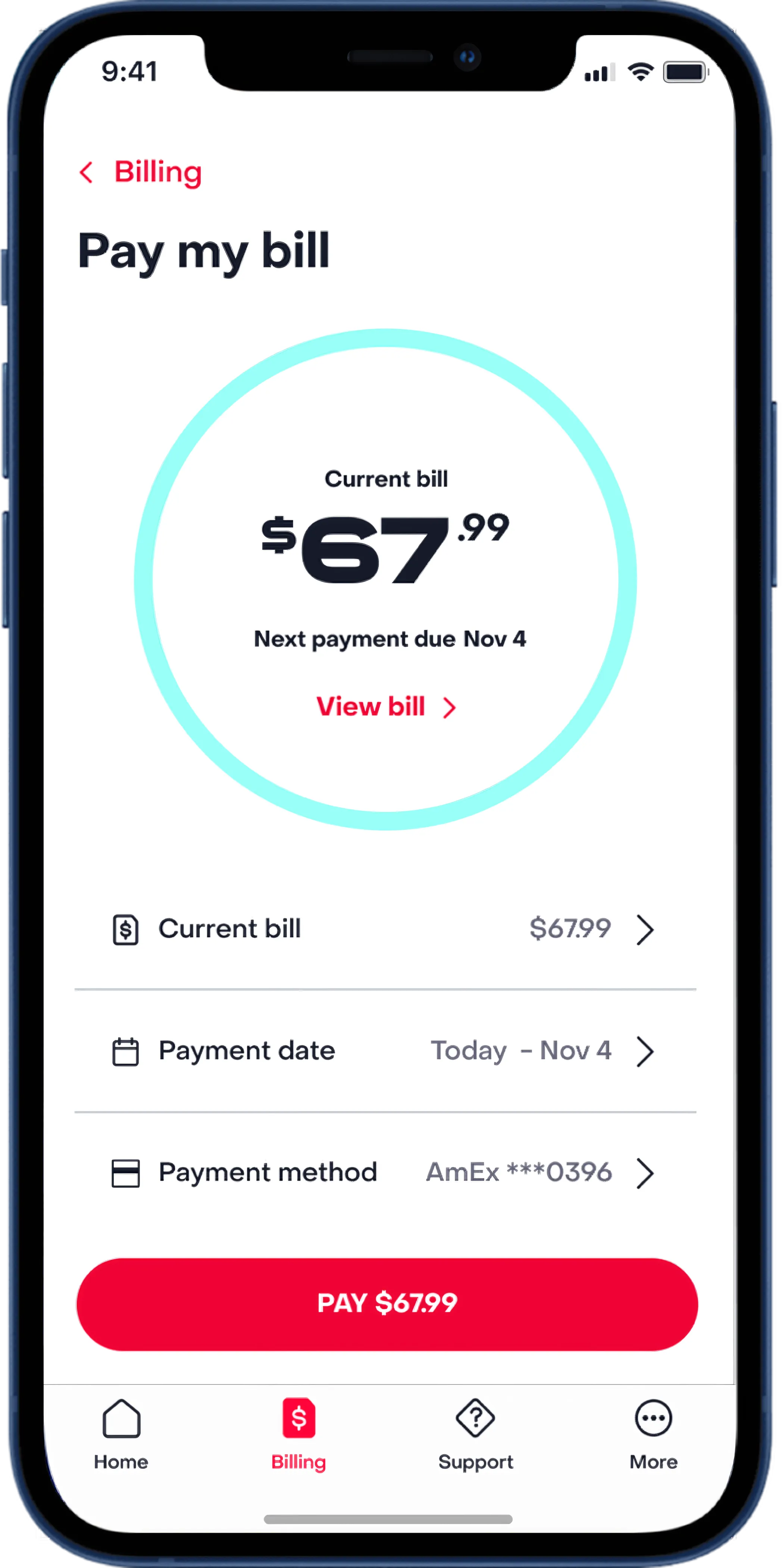
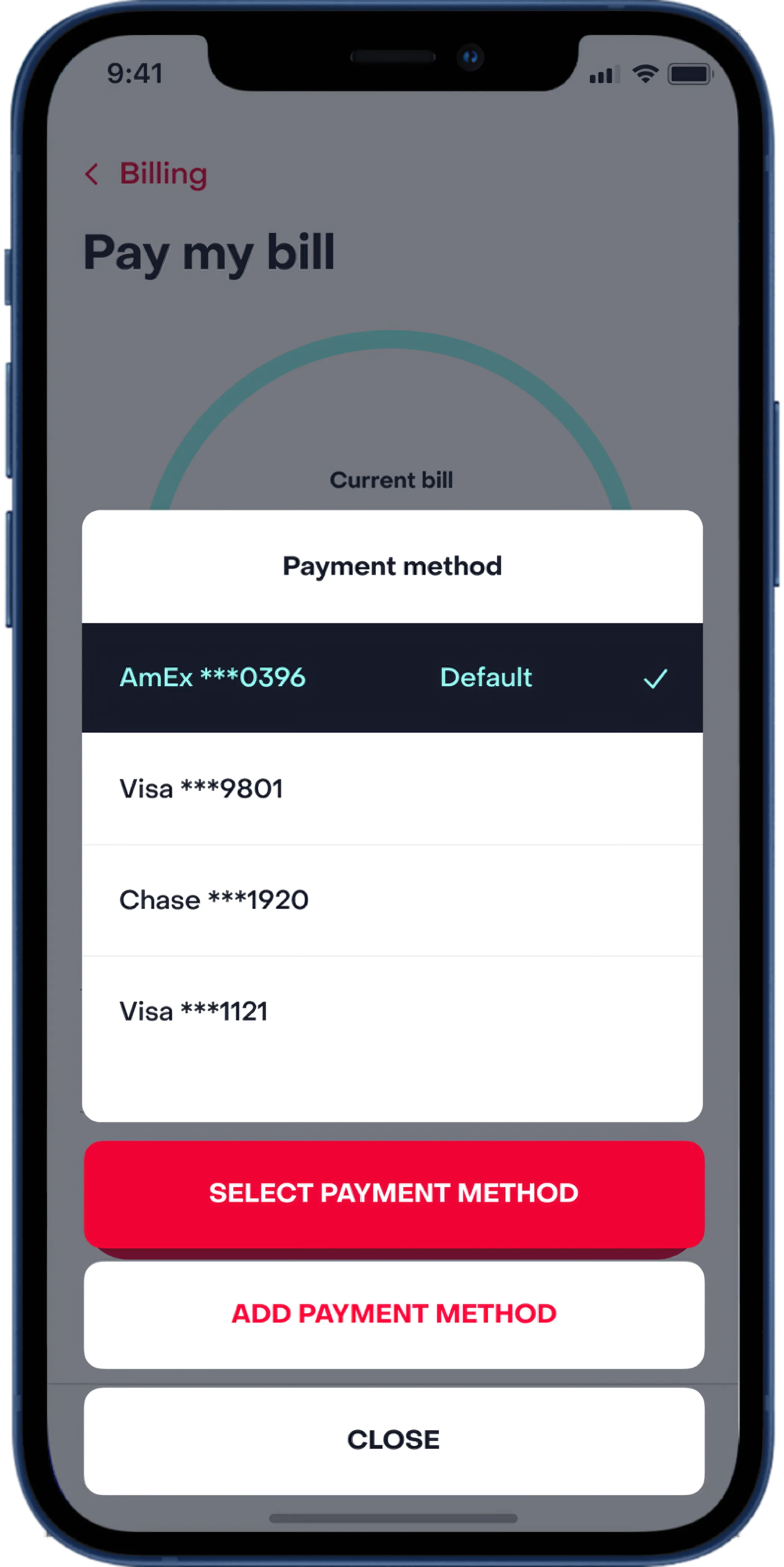
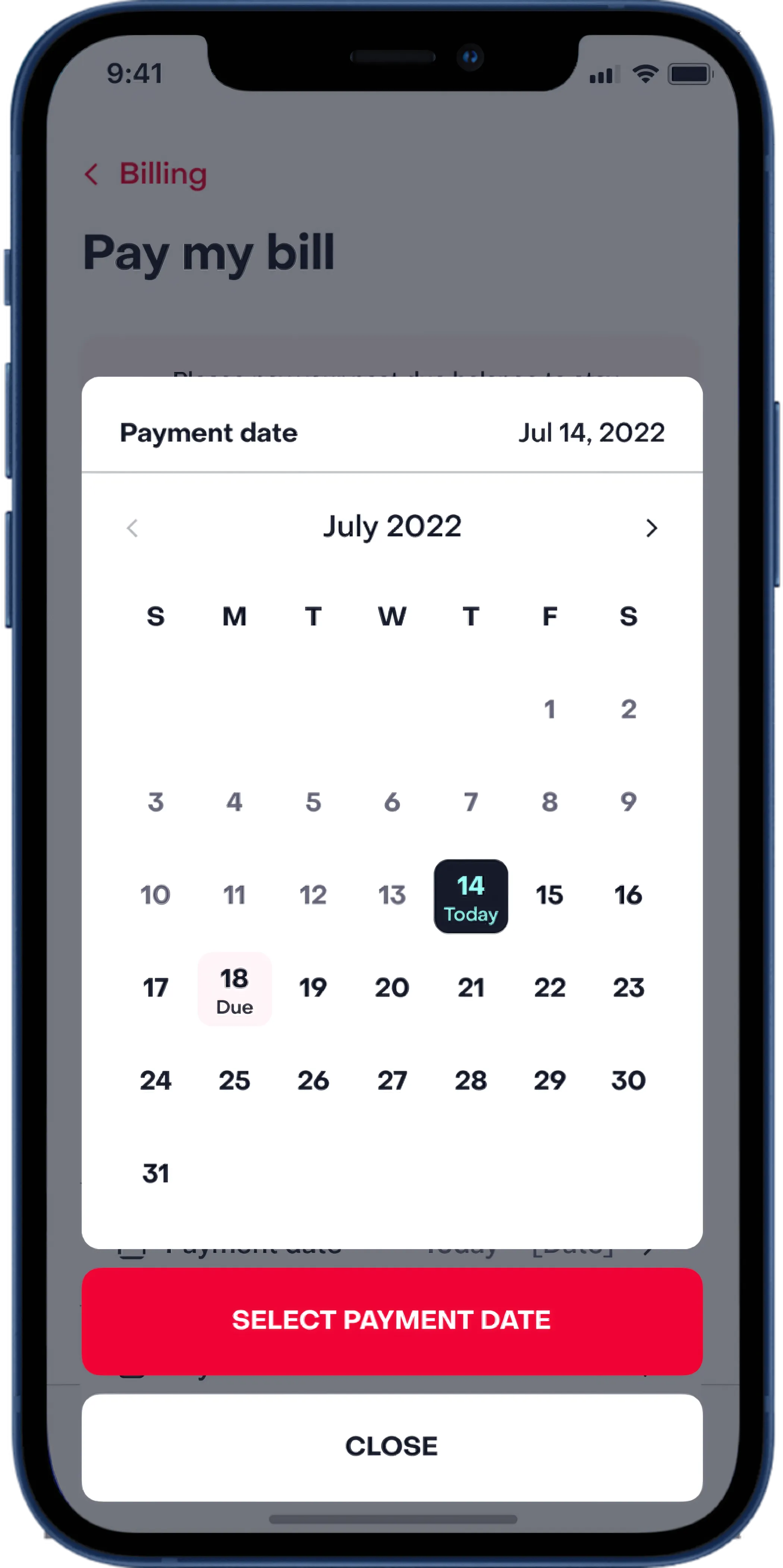
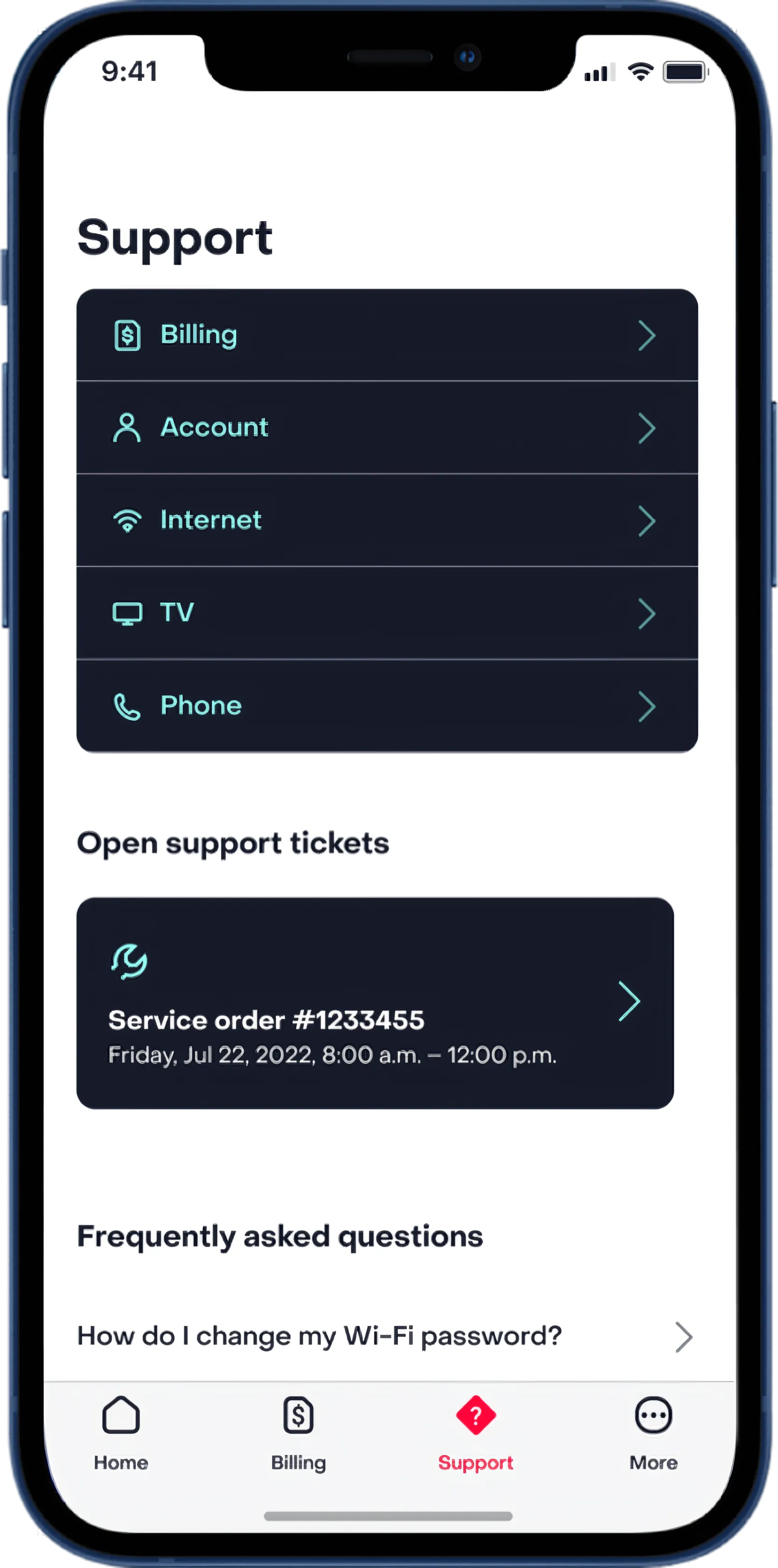
I owned layout across every core screen (onboarding, dashboard, bill pay, and support) and defined the hierarchy for the components they share: navigation, the appointment calendar, and selectors. The most important action on each screen gets the most visual weight, sized beyond what the tap target requires. Secondary actions sit in the same groups from flow to flow, so users build muscle memory across the app.
Motion Design
I built every Lottie file myself in After Effects. The coin confirmed a payment was processing, the leaf signaled setup completion, and the intro sequence covered the initial data load so the app felt responsive from the first tap. I delivered motion specs alongside the files: easing values, timing, and documentation so dev could implement without guesswork.
What Shipped
In four months, the team delivered every core screen (onboarding, dashboard, bill pay, and support) on one layout system. Four animations covered launch, payment, setup, and confirmation, each handed to dev with easing values, timing, and implementation notes.
What I Learned
In a utility app, the user’s trust is already conditional. A telecom app can’t afford animation that says “look at us.” Each animation had to solve a specific problem or it got cut. That constraint produced better work than having free rein would have. The motion specs and dev handoff documentation mattered as much as the animations themselves. Without clear easing values and timing, the implementation would have drifted from the intent.