2022–2025
All workSamsung Bespoke Appliance Configurator
An appliance configurator that beat standard product pages on add-to-cart by 6x+ for fridges and 10x+ for kitchens.
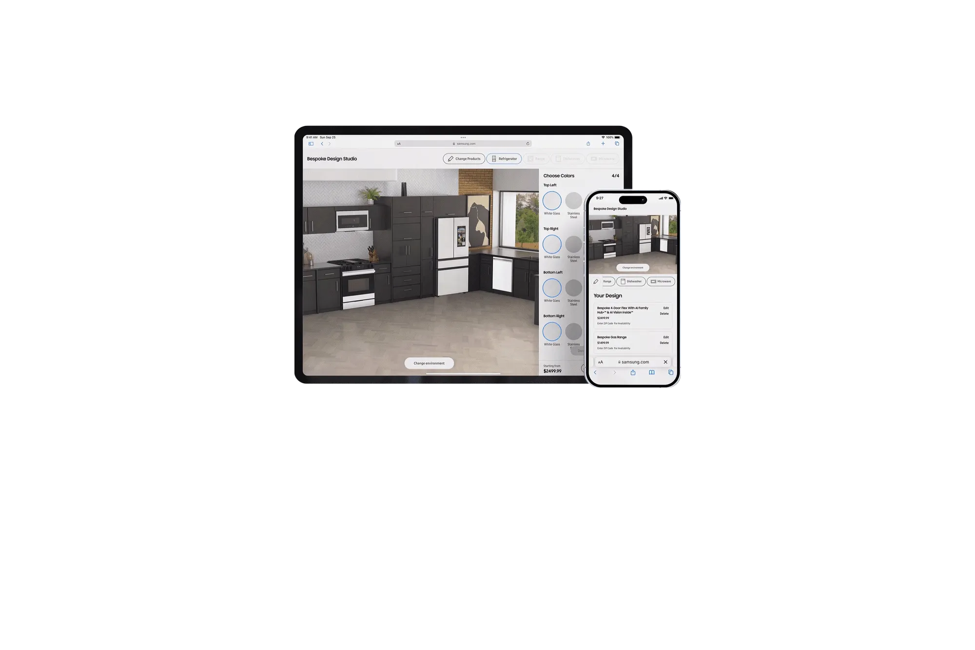
Fridge shoppers who used the configurator added to cart at more than 6 times the rate of standard product pages, and kitchen shoppers at more than 10 times. Over 12 months it drove nine figures in incremental revenue. Samsung’s Bespoke line lets customers configure appliances down to the panel finish, but online, every choice arrived at once. I led design across the whole Bespoke line for a couple of years, with one senior designer, and made the call that shaped the tool: sequence the decisions the way a salesperson would, and reveal each one only when the last was settled.
The Problem
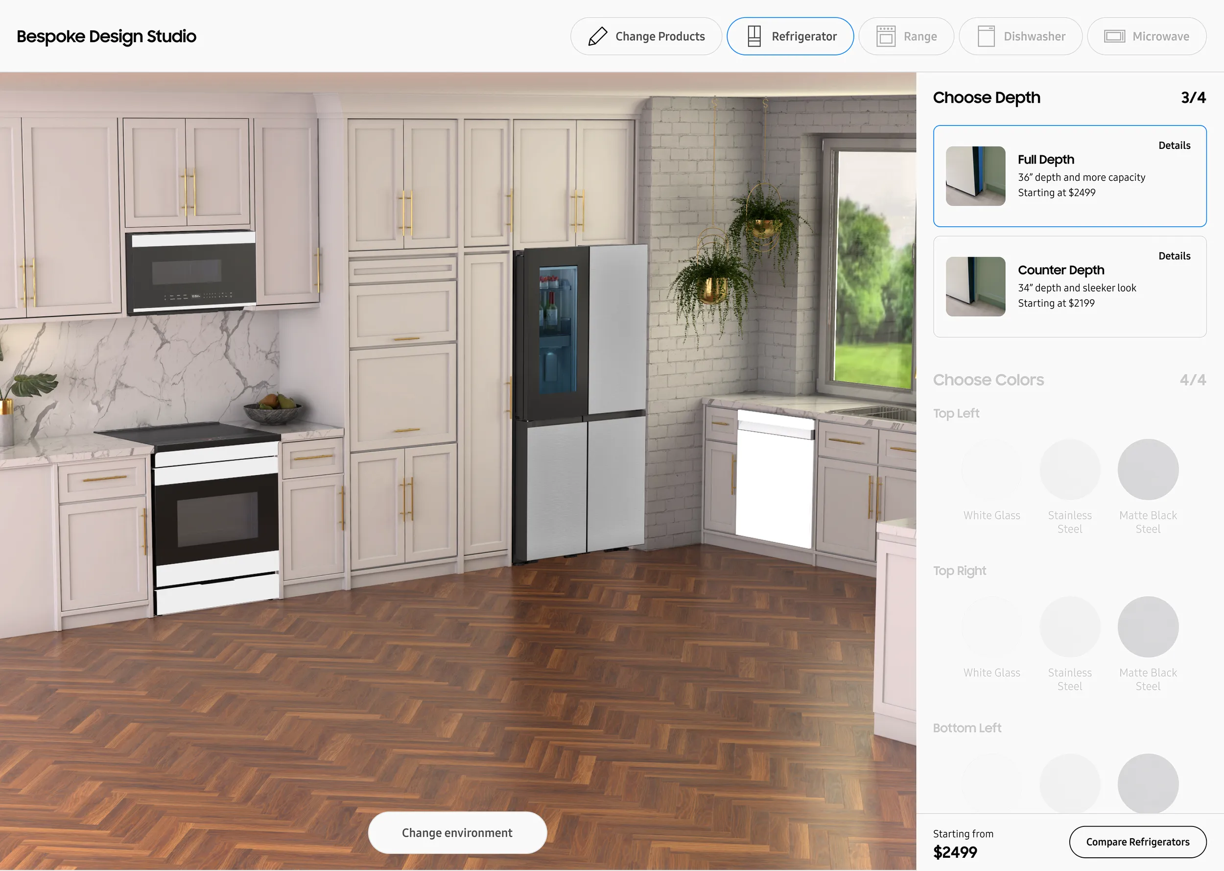
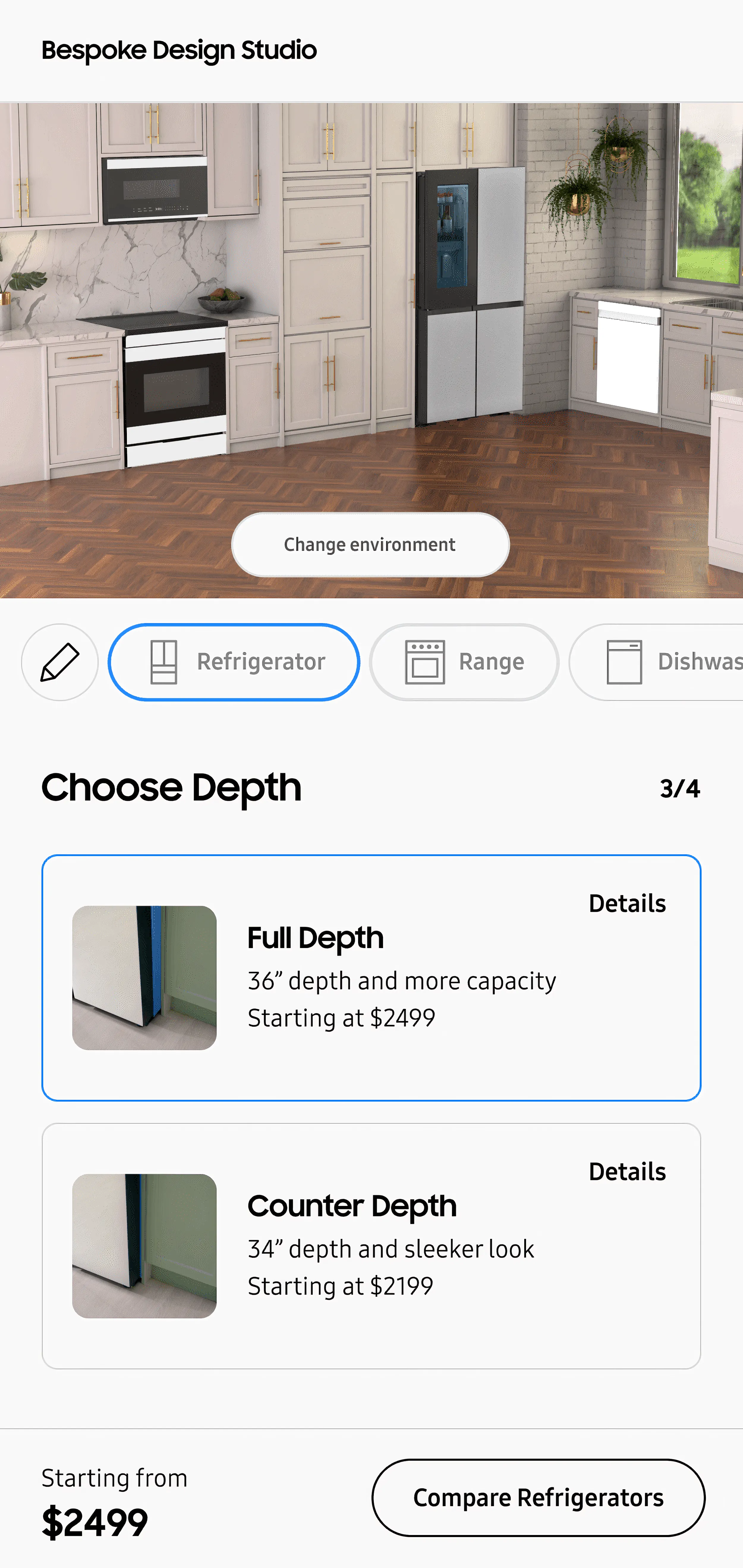
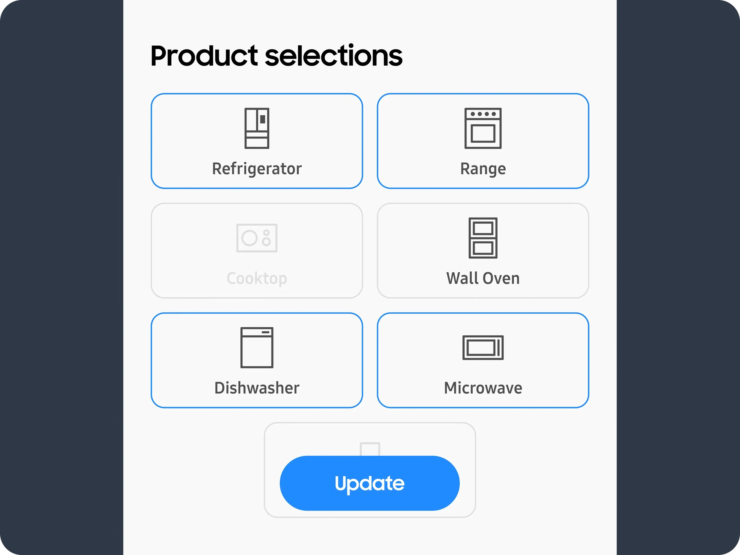
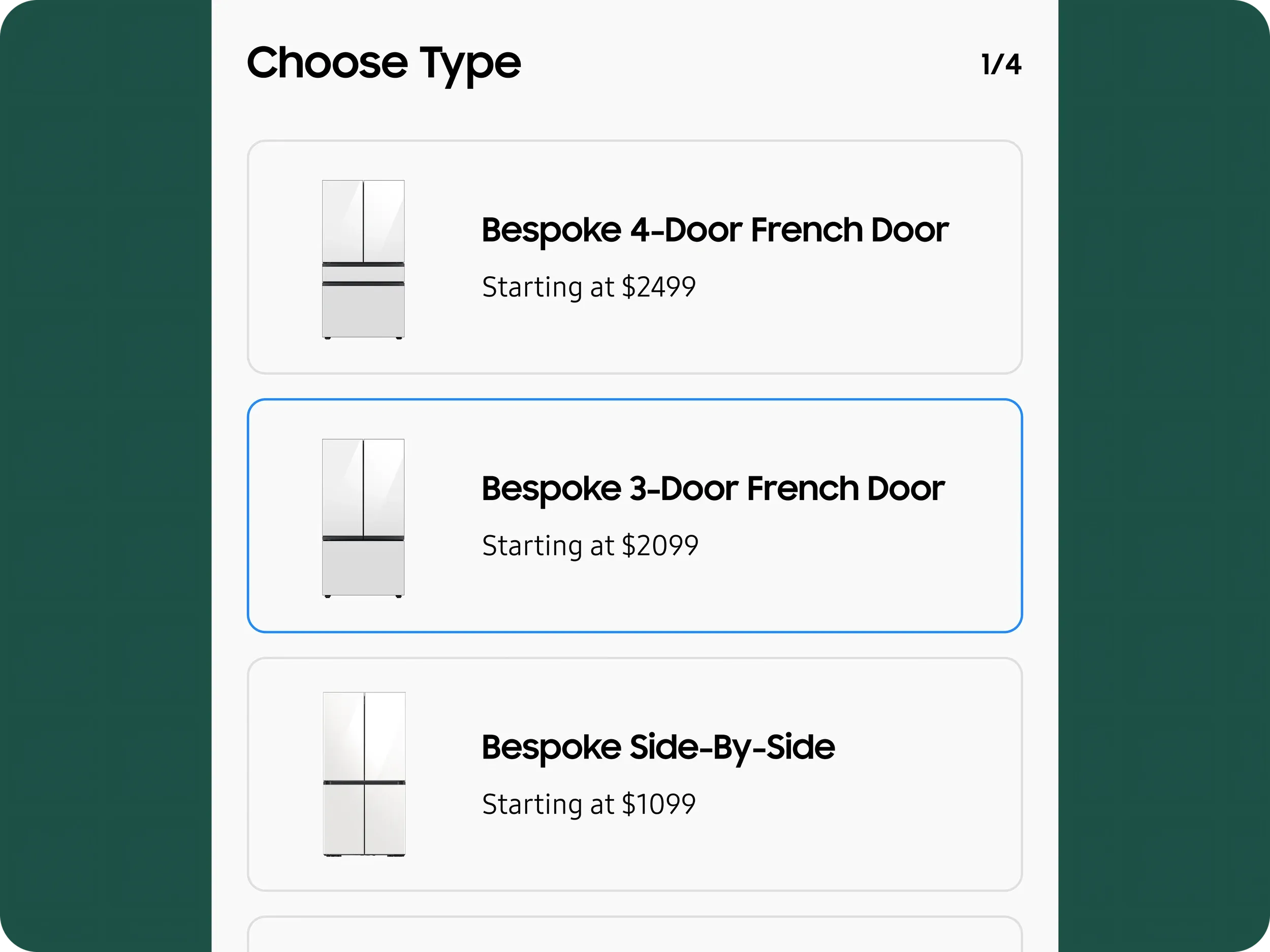
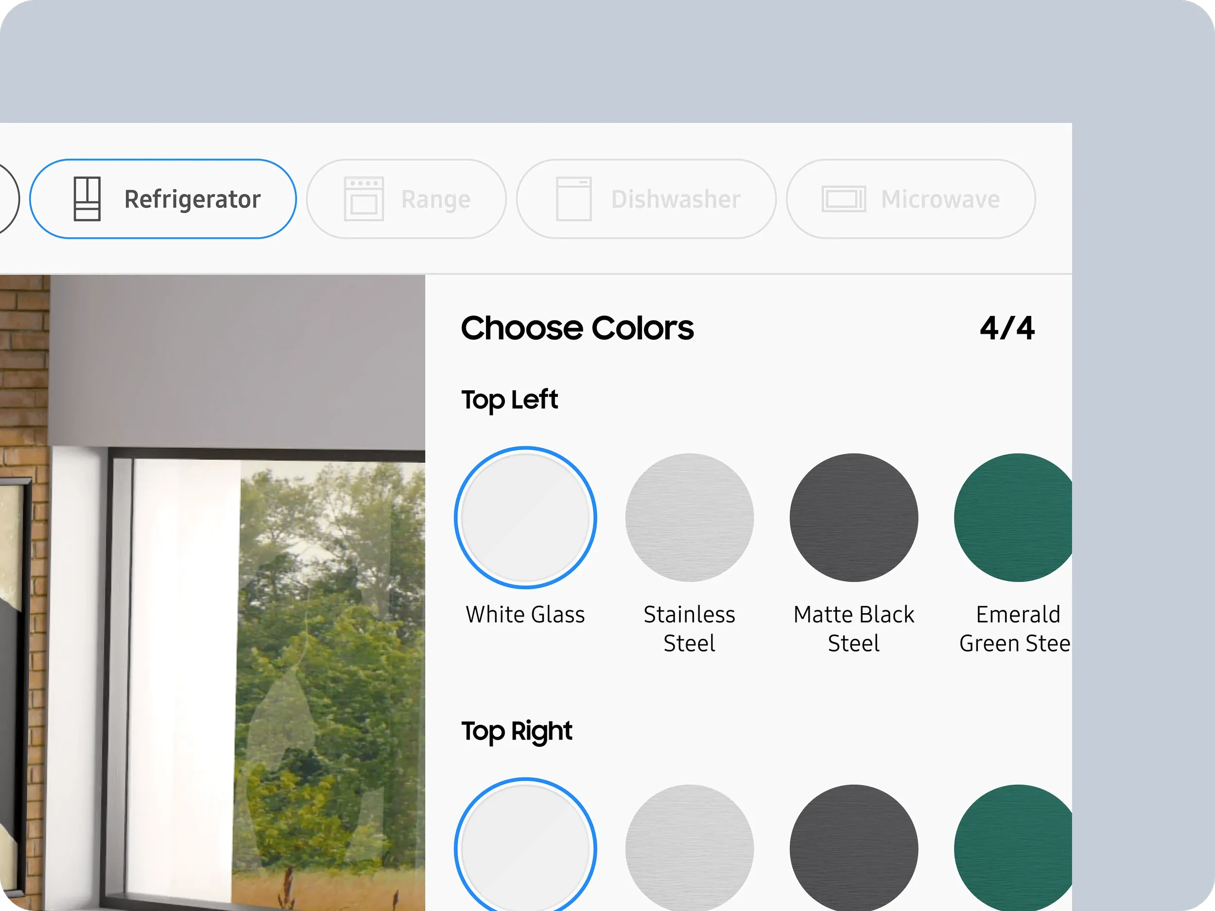
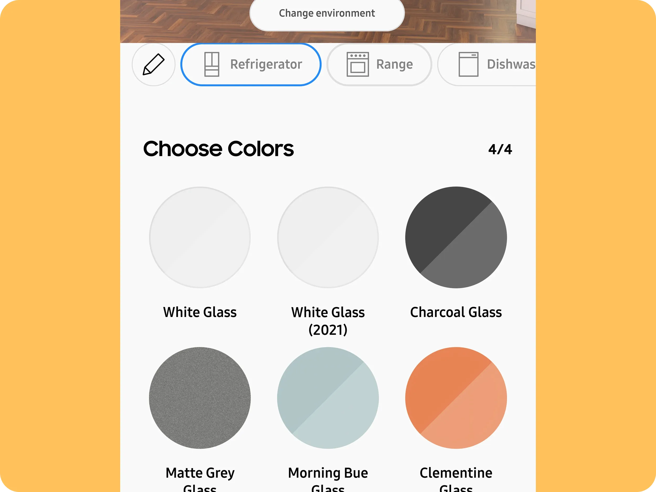
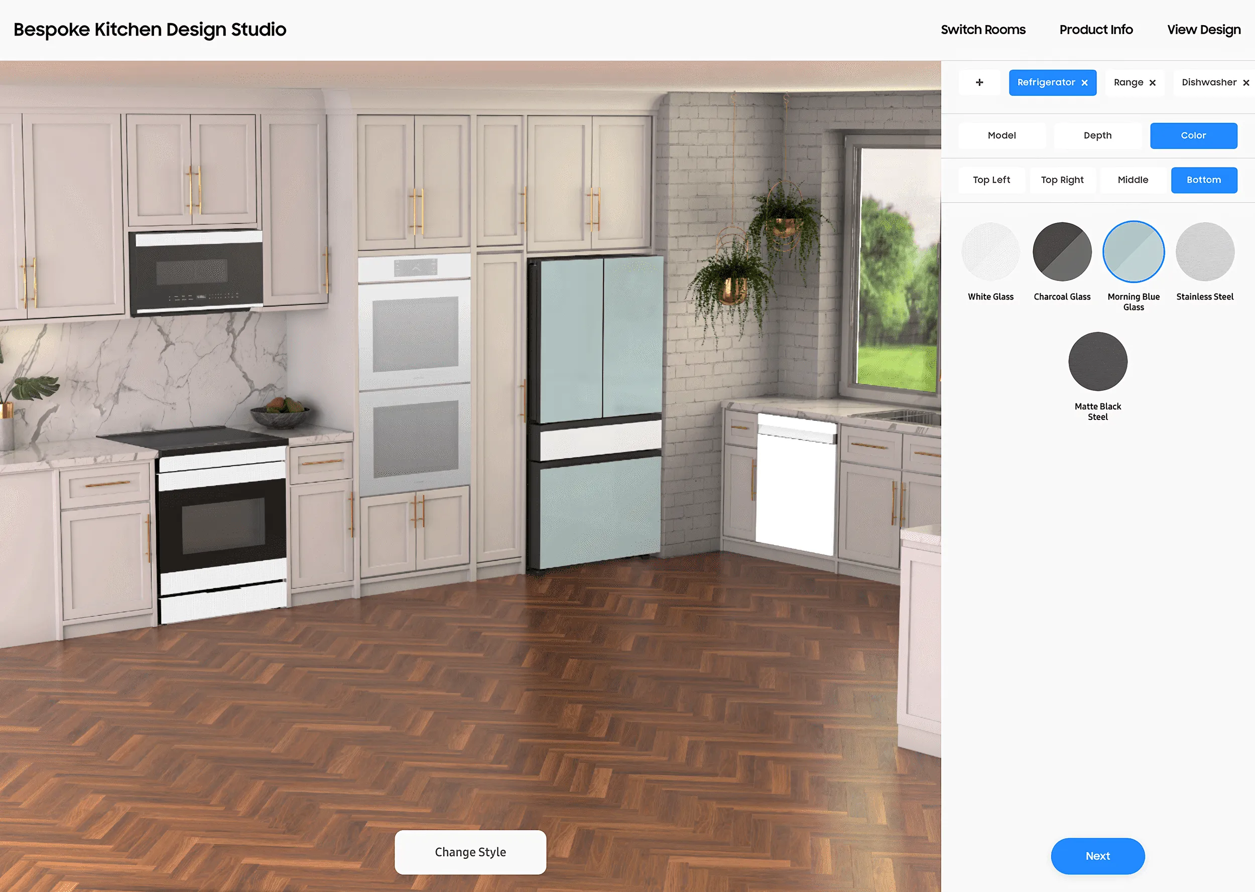
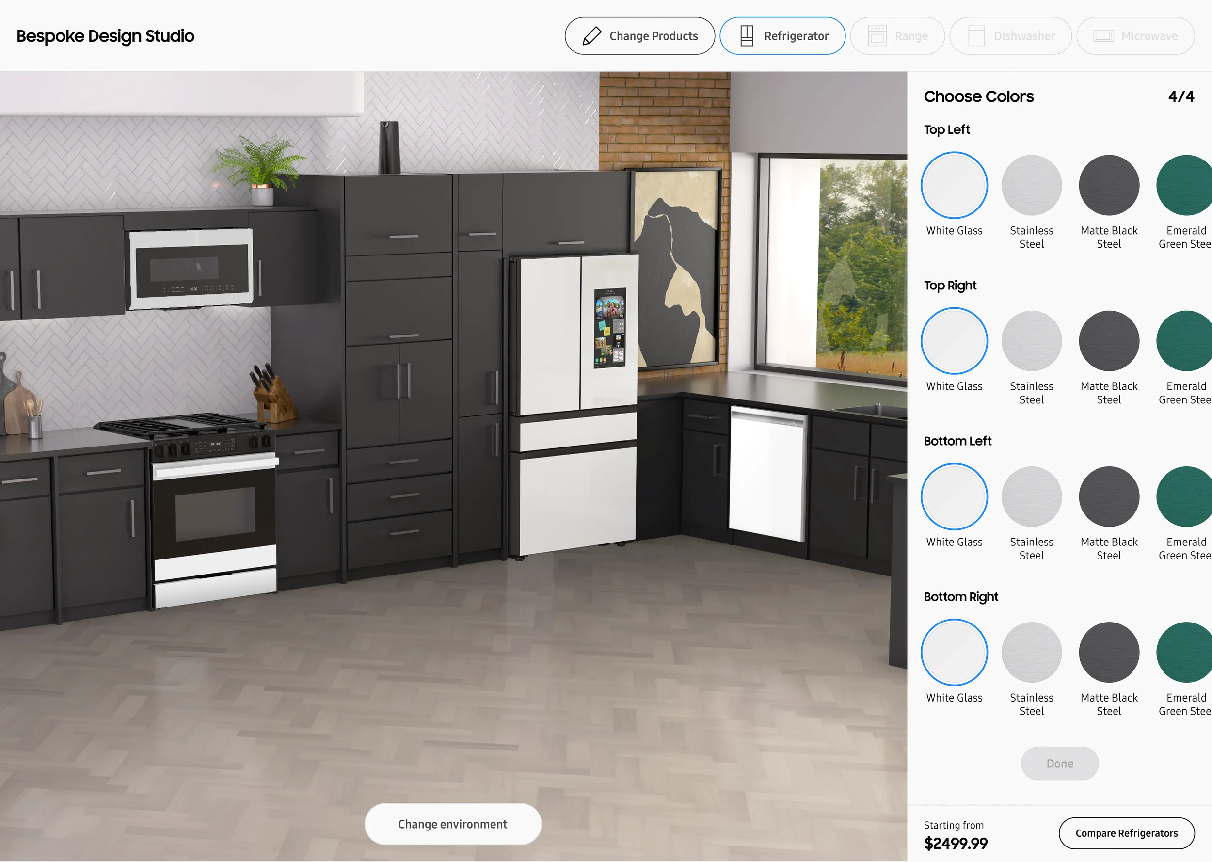
A customer configuring a Bespoke fridge has to pick a model, then a size, then colors for four separate door panels. Show all of that at once and people bail. The early prototypes confirmed this. Show too little and they don’t understand their options. The core challenge was progressive disclosure: finding the right order to present decisions so each step felt obvious. In-store, a salesperson sequences those choices naturally. Online, the interface has to do that work.
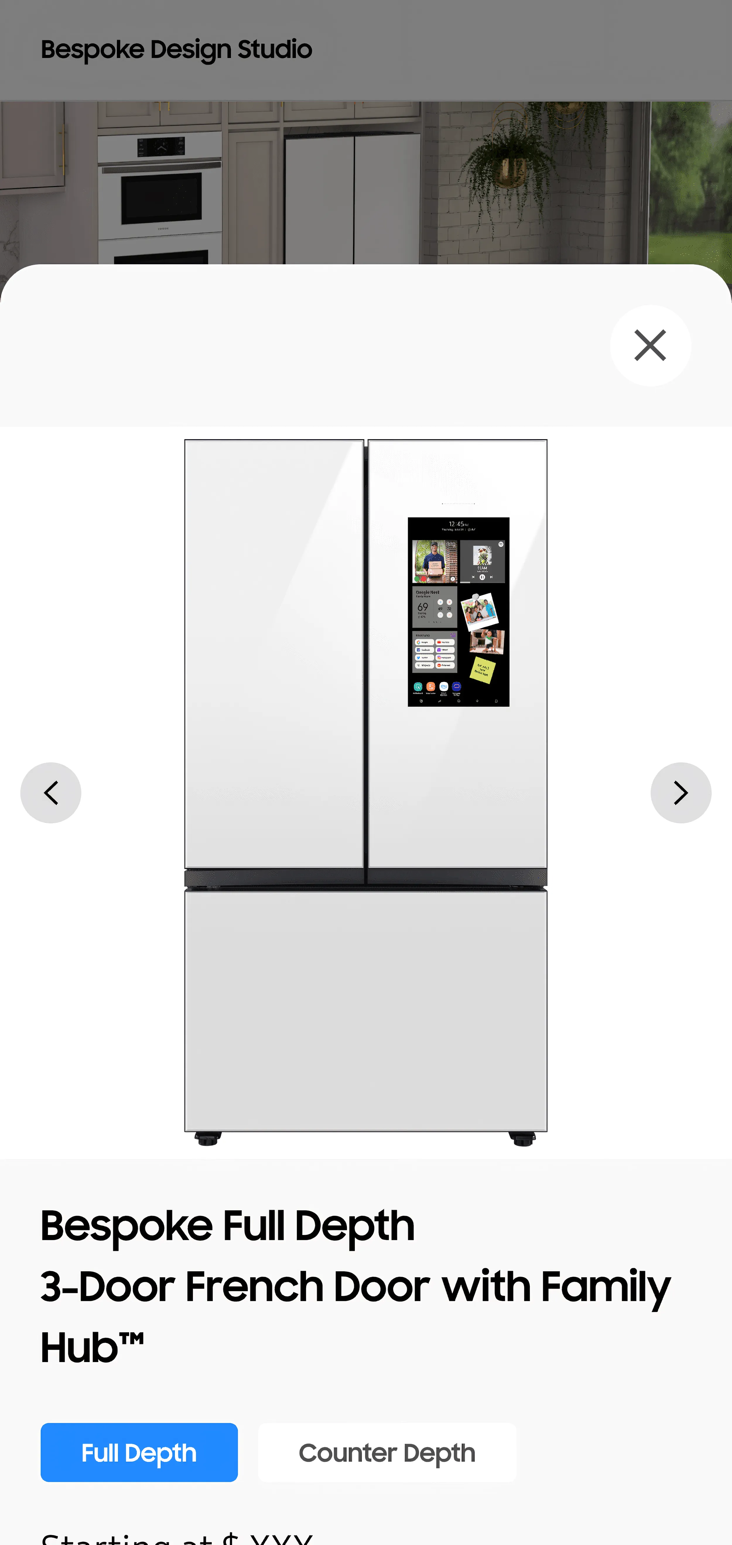
Wireframes
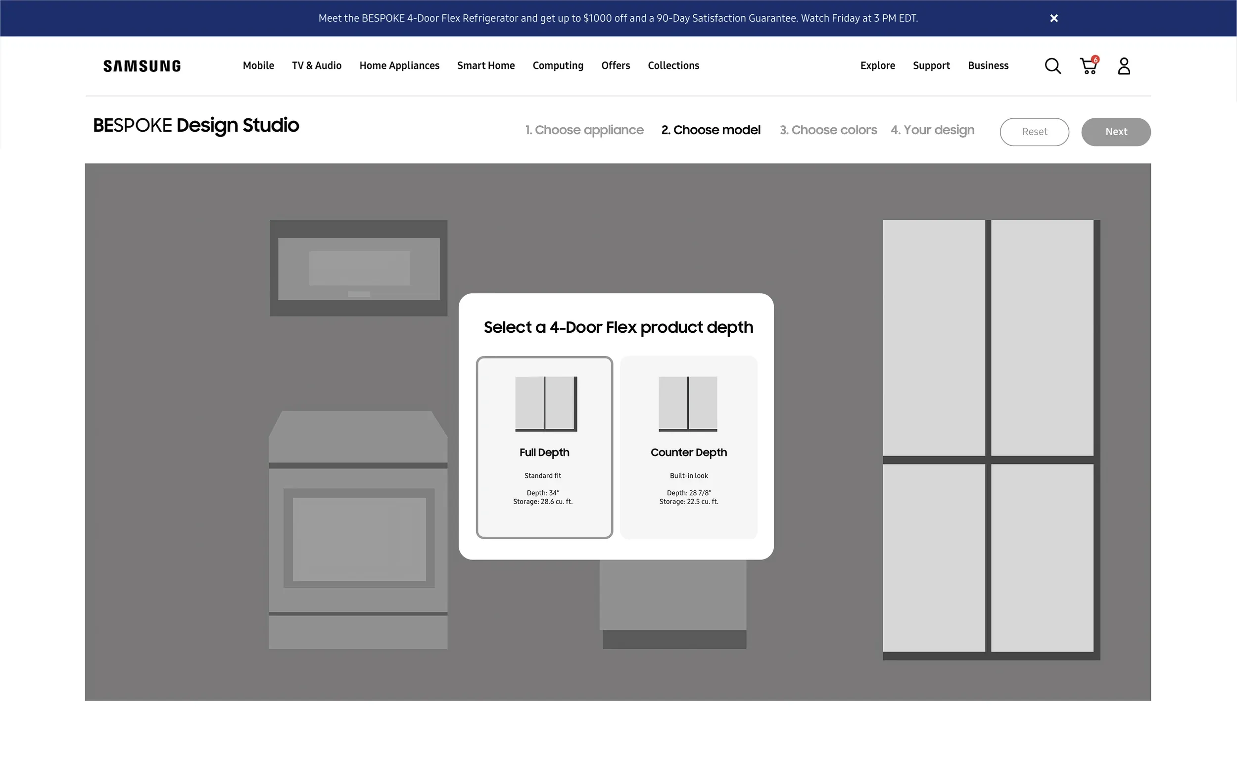
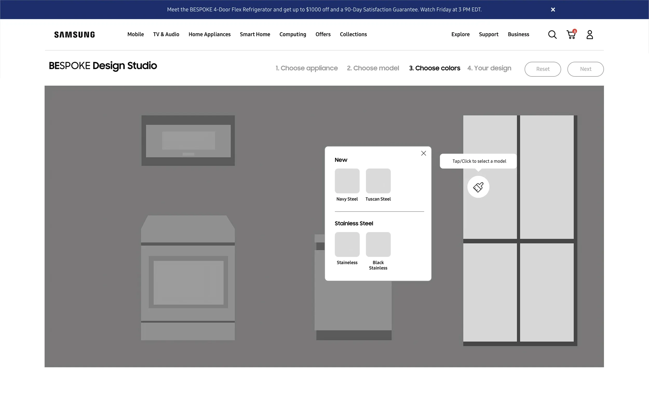
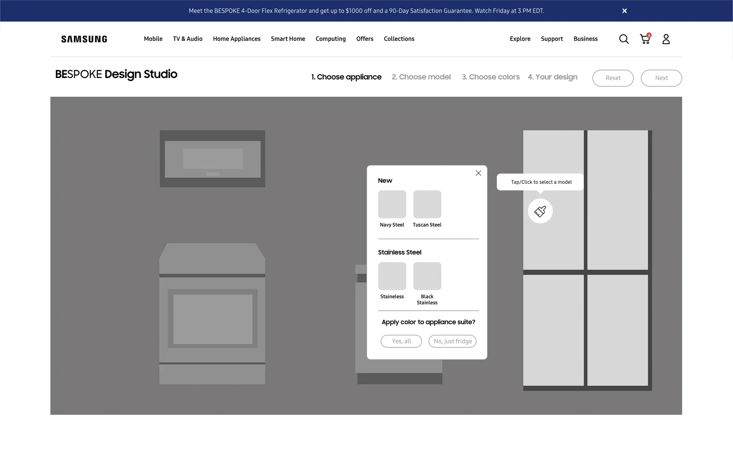
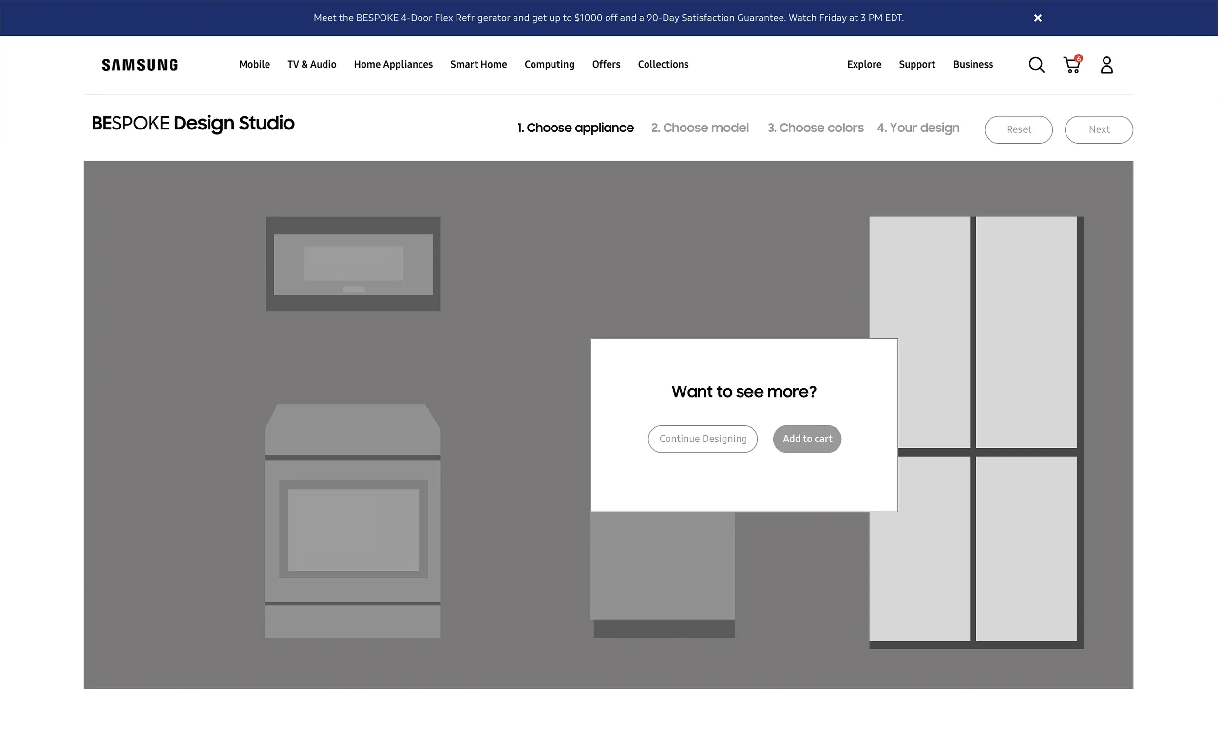
Multiple rounds of wireframing explored how to sequence the configuration steps. The core tension: each decision depended on the previous one (you can’t pick panel colors until you’ve chosen a model), but users needed to understand the full scope before committing to step one.
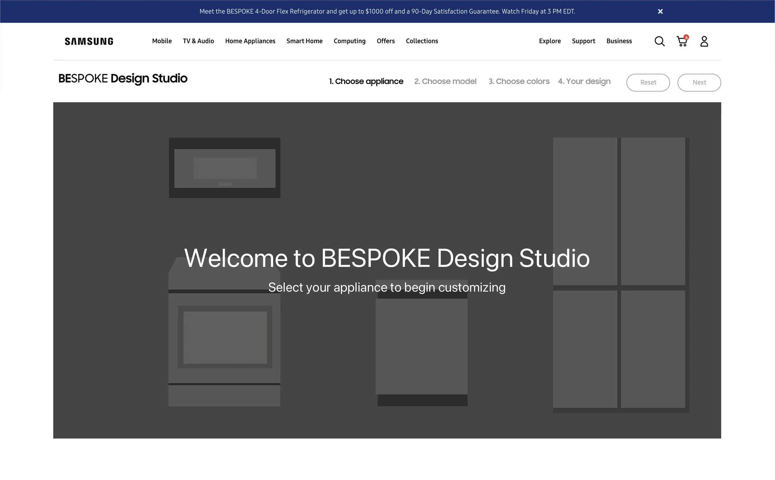
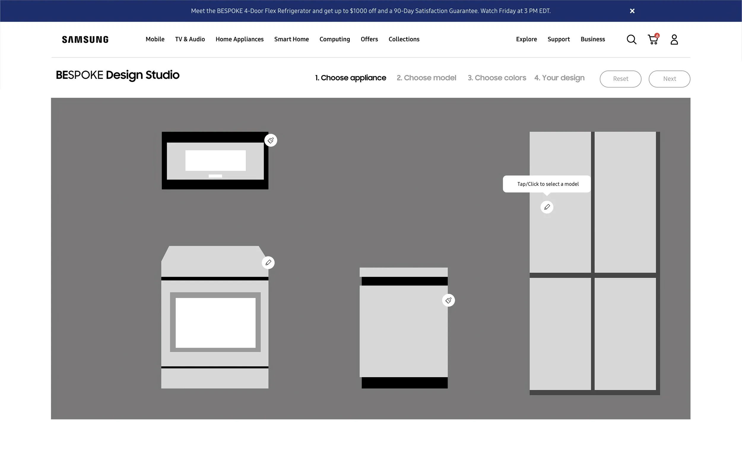
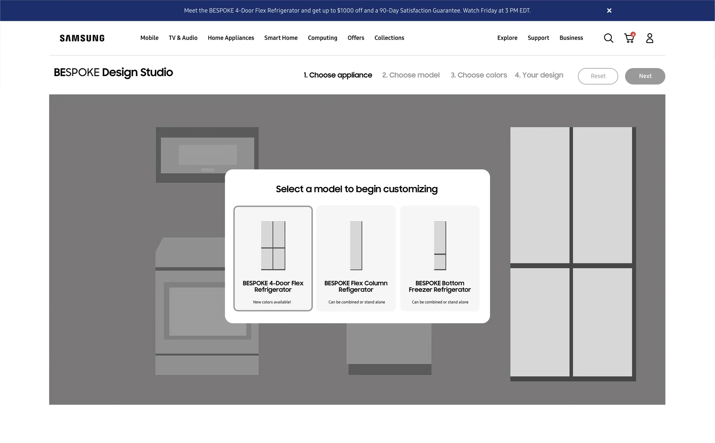
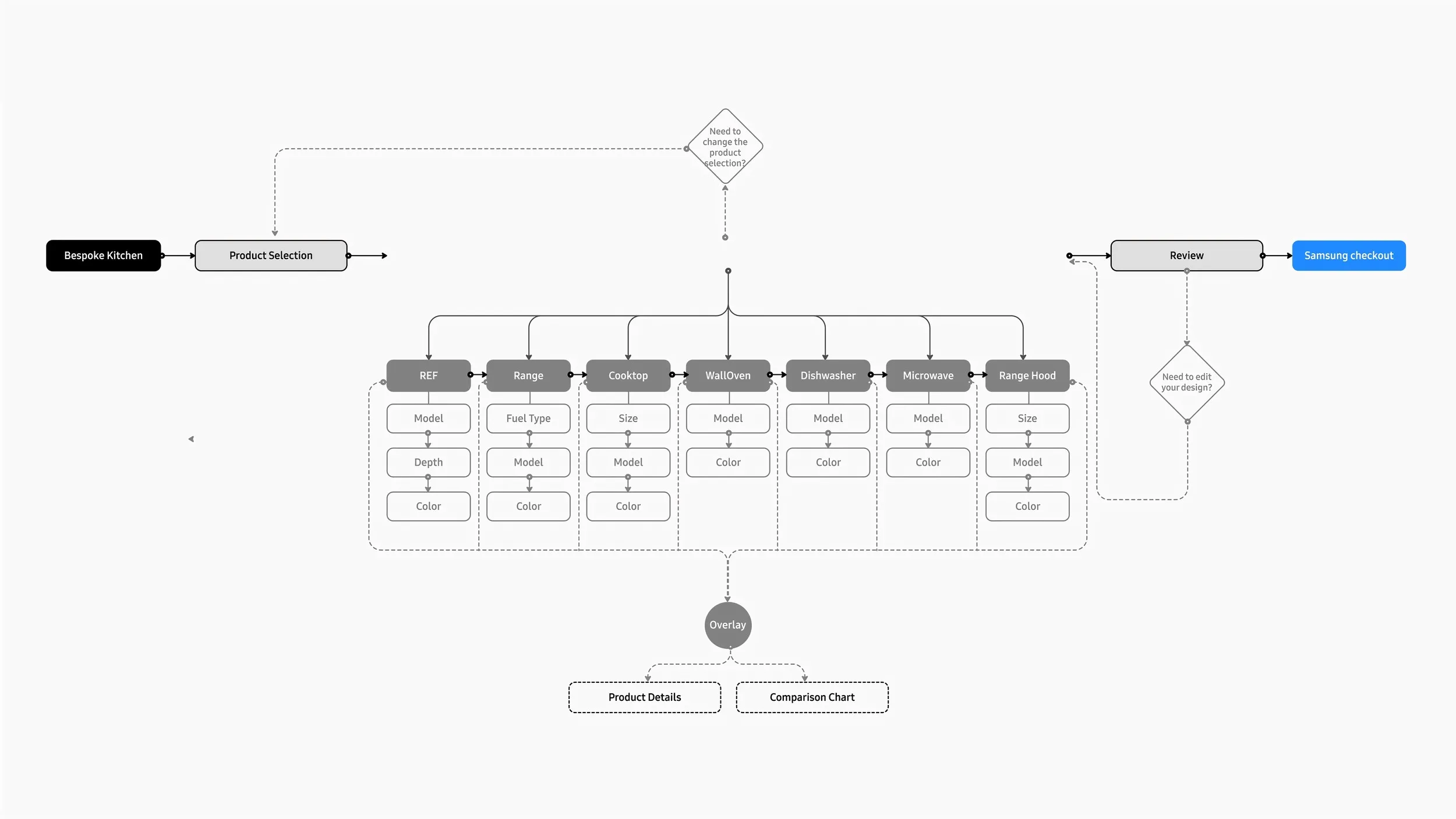
User Flow
The user flow mapped every decision point and branch. The stepped progress indicator was visible at every stage, giving users a finite scope before they committed to step one.
The Progress Indicator
The sequencing call needed a visible spine. I designed a stepped progress indicator that showed the scope of remaining decisions upfront, so users could see they were three steps from done rather than wondering if the choices would ever end.
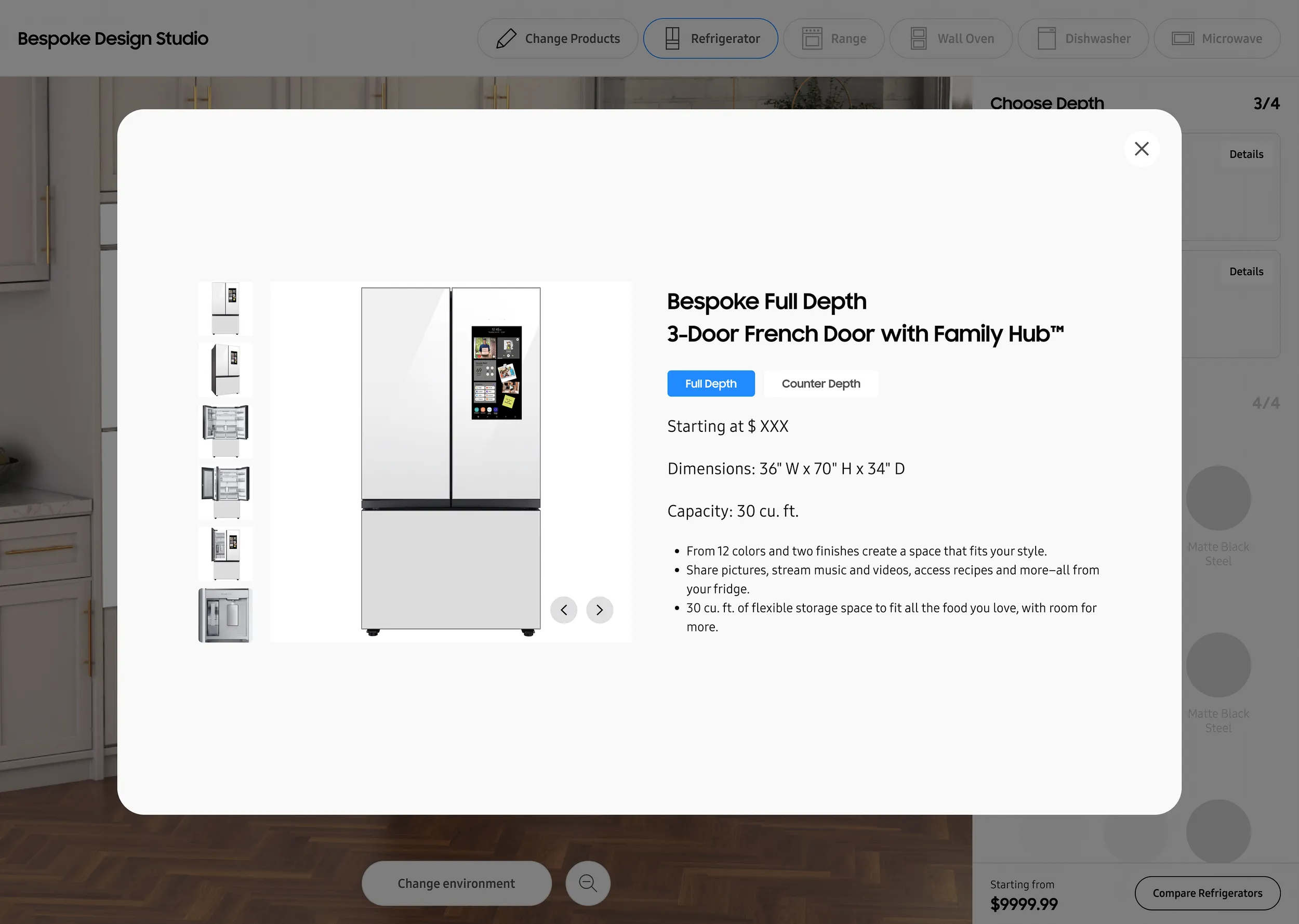
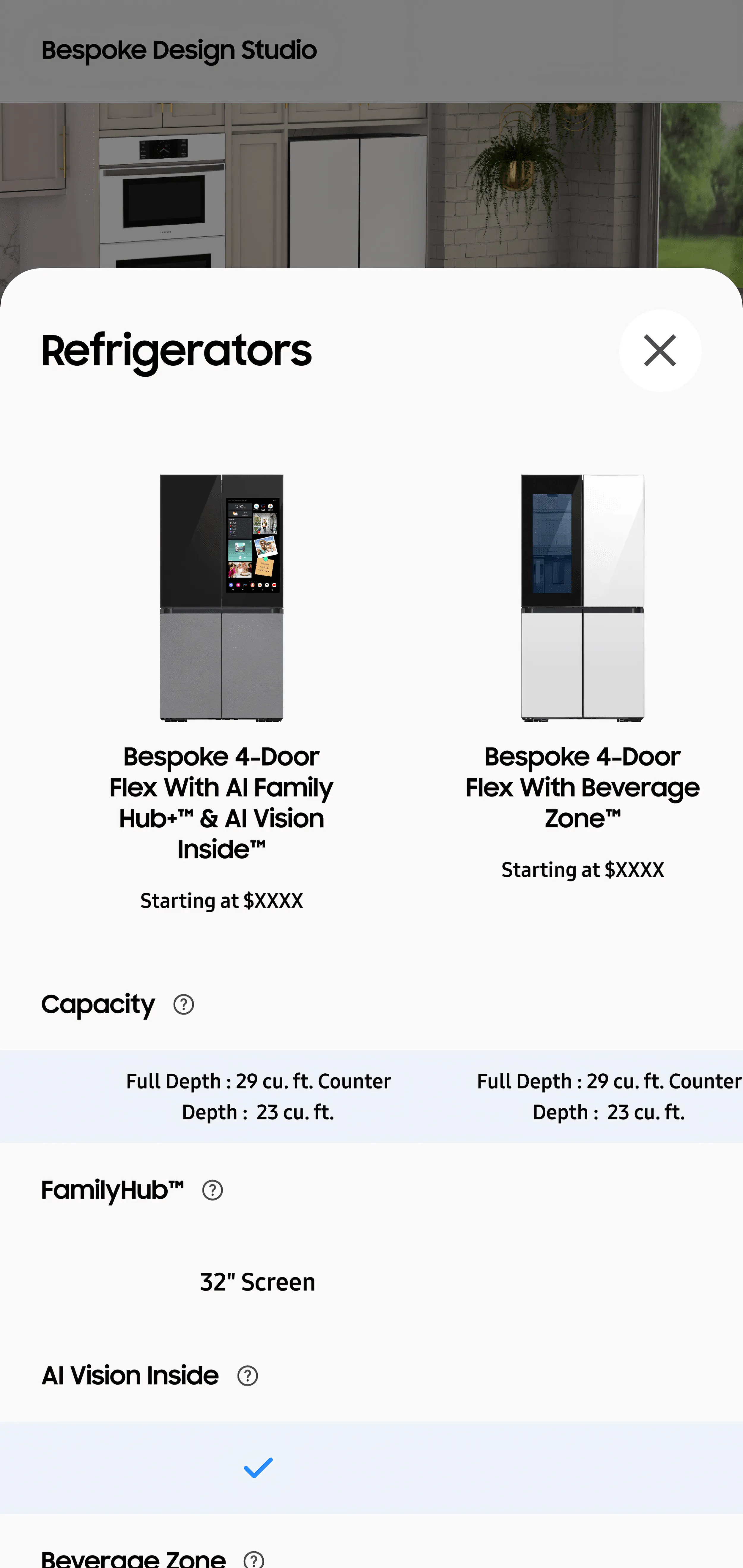
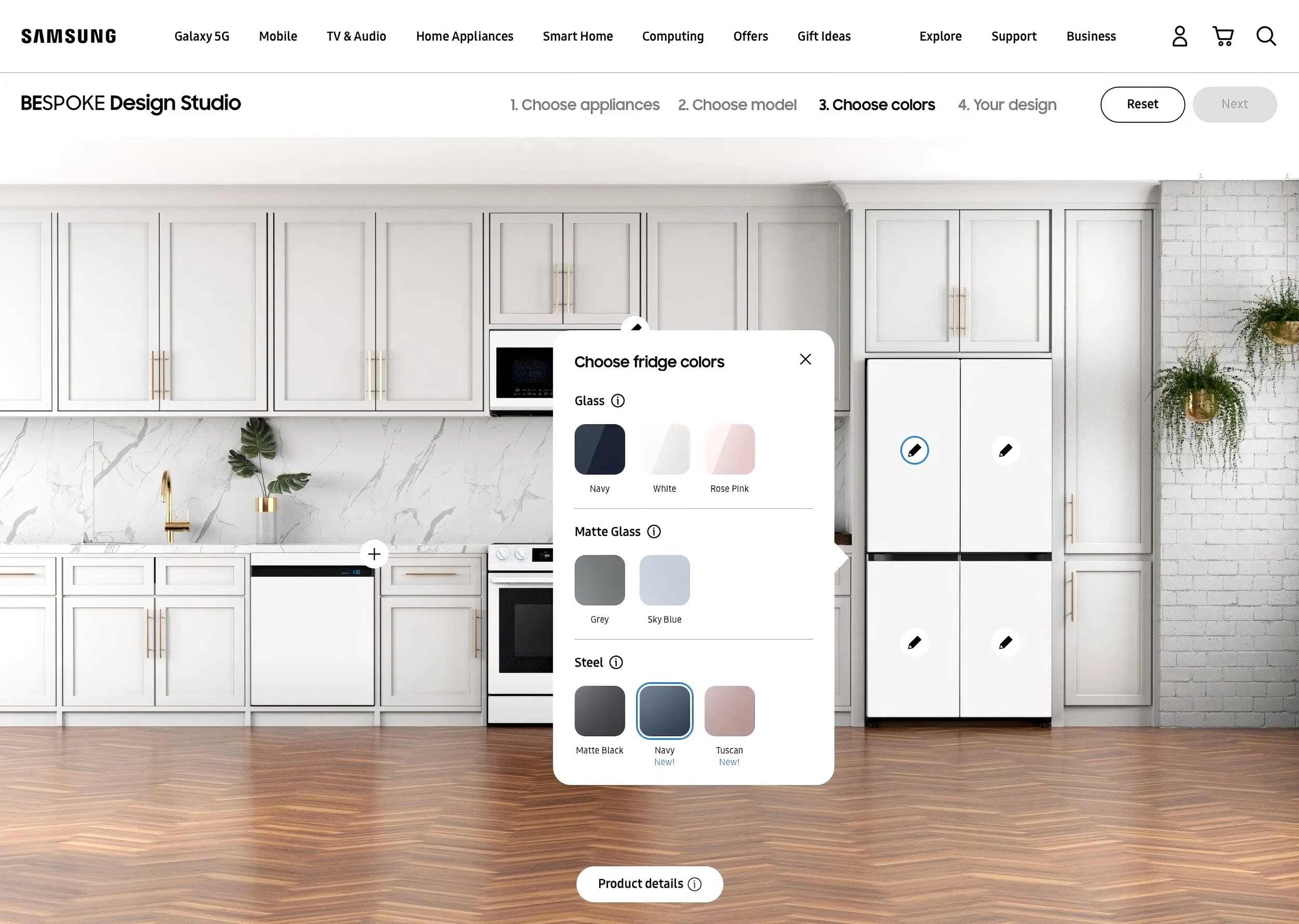
Design Execution
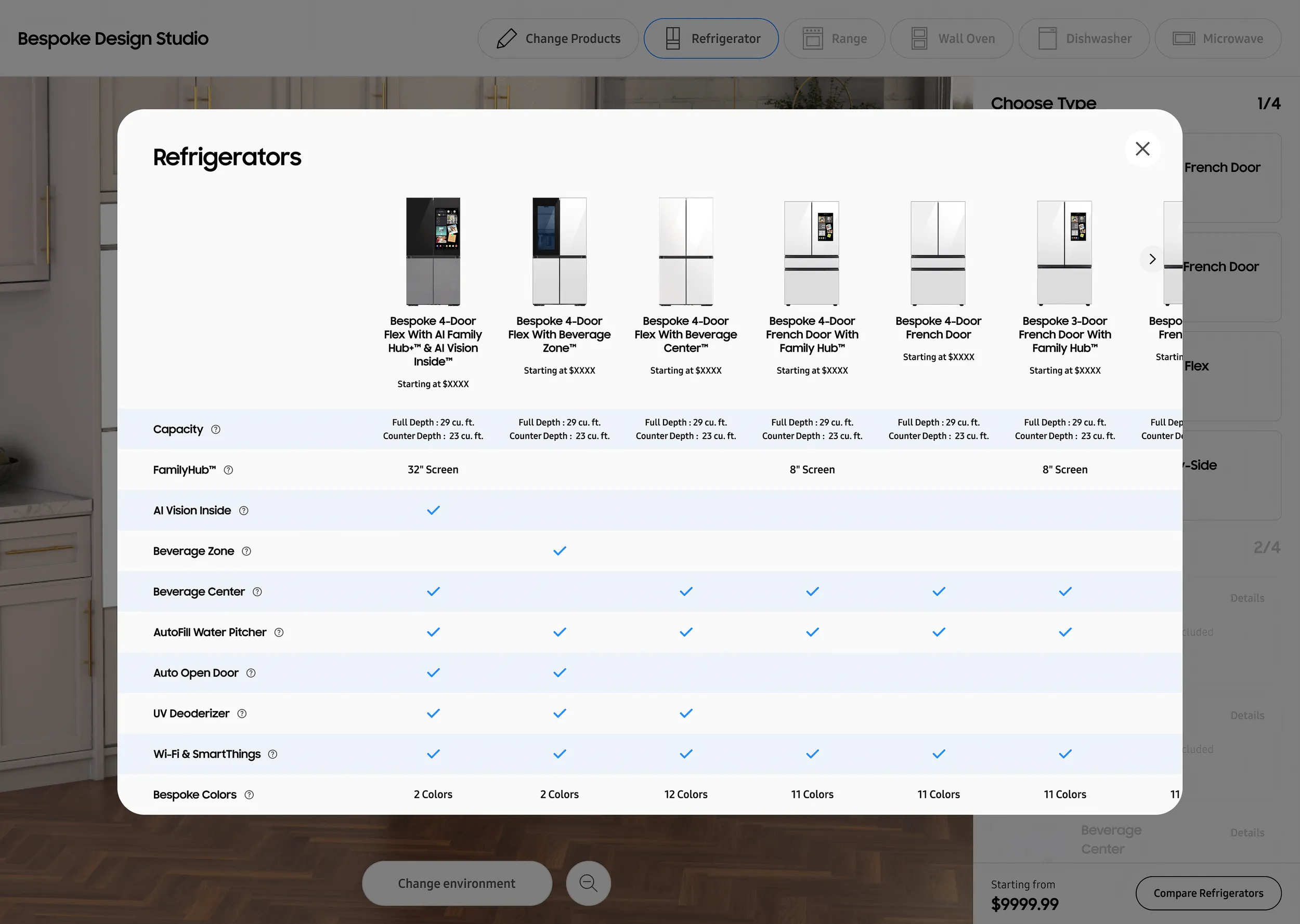
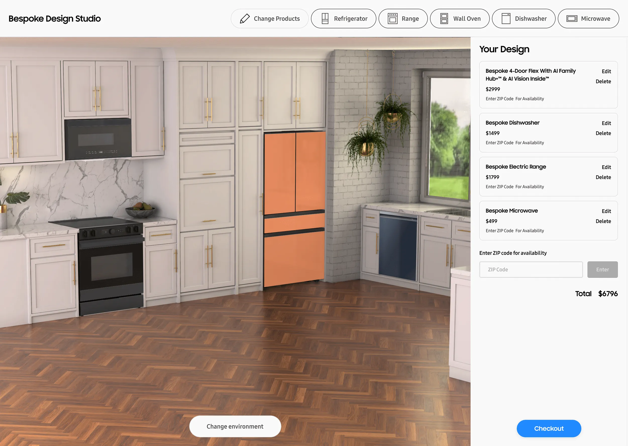
I led UI and interaction design across mobile and desktop. Color swatches appeared only when relevant. Model comparisons showed only the specs that differed. I scoped the system to the configurator’s current needs, not a hypothetical future.
Outcomes
The refrigerator configurator’s add-to-cart rate was more than 6 times that of standard product pages, and the kitchen configurator’s more than 10 times, with order rates up more than 50% on both. By mid-2023 the tool was running a 73% customization rate and a 66% continuation rate. In the 12 months to May 2024, the kitchen simulator beat its add-to-cart target by 36 points, and nearly half of its buyers bought more than one appliance.
The configurator kept growing after launch. It expanded from refrigerators to laundry in August 2022, then to a full kitchen simulator in April 2024 that carried 36 models, 18 of them new. An April 2025 update added 25 SKUs, and a separate build ran on Conn’s and P.C. Richard’s sites.
What I Learned
The hardest part of this project was sequencing. Progressive disclosure is a series of trade-offs: every decision you defer to a later step is a decision the user might not reach. What worked was turning an open-ended process into a finite one. Once users could see exactly how many decisions remained, they stopped wondering if the choices would ever end and started moving through them.